|
|
|||||||||||||||||||||||||
Replies
Posts in this topic
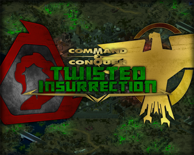
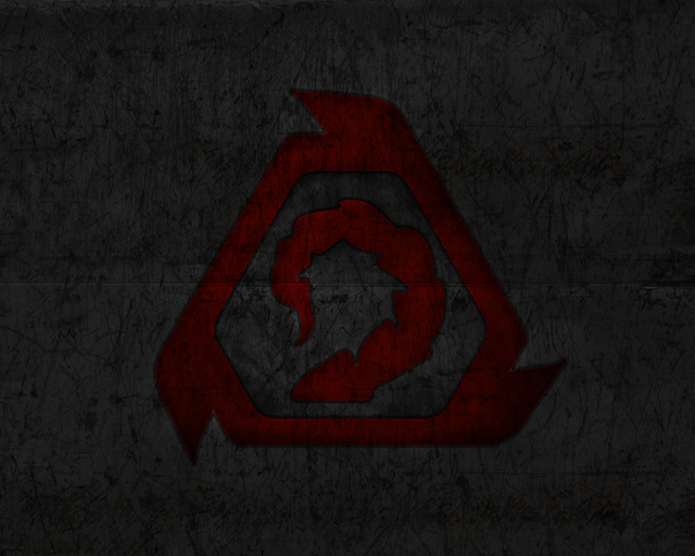
 Aro Twisted Insurrection: Wallpapers Jan 6 2010, 04:45 PM Aro Twisted Insurrection: Wallpapers Jan 6 2010, 04:45 PM Vintriaz I personally think these turned out fantastic ... Jan 6 2010, 10:57 PM Aro Added another one, render by LKO photoshopped by m... Jan 7 2010, 09:01 AM Vintriaz I personally think these turned out fantastic ... Jan 6 2010, 10:57 PM Aro Added another one, render by LKO photoshopped by m... Jan 7 2010, 09:01 AM  ^Rampastein I also don't like logos, but the wallpapers ar... Jan 7 2010, 09:20 AM The DvD Would like the Nod logo in 16:10 or 16:9 aspect ra... Jan 7 2010, 12:06 PM Aro Here you go.
1600 x 1000 Jan 7 2010, 01:53 PM The DvD QUOTE (Aro @ Jan 7 2010, 02:53 PM) Here y... Jan 7 2010, 11:41 PM Team Black win! Jan 7 2010, 04:23 PM Aro You're welcome! I'd happily take in Re... Jan 8 2010, 12:08 AM 2kool4u526 can i have the nod march in 1024x768, please Jan 8 2010, 01:04 AM ^Rampastein 1280x1024 should fit quite well on a 1024x768 scre... Jan 8 2010, 02:11 PM eXit QUOTE (Aro @ Jan 8 2010, 02:08 AM) I... Jan 8 2010, 01:36 PM Altzan These are great, excellent job! Jan 11 2010, 01:33 PM ^Rampastein I also don't like logos, but the wallpapers ar... Jan 7 2010, 09:20 AM The DvD Would like the Nod logo in 16:10 or 16:9 aspect ra... Jan 7 2010, 12:06 PM Aro Here you go.
1600 x 1000 Jan 7 2010, 01:53 PM The DvD QUOTE (Aro @ Jan 7 2010, 02:53 PM) Here y... Jan 7 2010, 11:41 PM Team Black win! Jan 7 2010, 04:23 PM Aro You're welcome! I'd happily take in Re... Jan 8 2010, 12:08 AM 2kool4u526 can i have the nod march in 1024x768, please Jan 8 2010, 01:04 AM ^Rampastein 1280x1024 should fit quite well on a 1024x768 scre... Jan 8 2010, 02:11 PM eXit QUOTE (Aro @ Jan 8 2010, 02:08 AM) I... Jan 8 2010, 01:36 PM Altzan These are great, excellent job! Jan 11 2010, 01:33 PM
1 User(s) are reading this topic (1 Guests and 0 Anonymous Users)
0 Members:

|
|||||||||||||||||||||||||
|
|
|||||||||||||||||||||||||


 Jan 6 2010, 04:45 PM
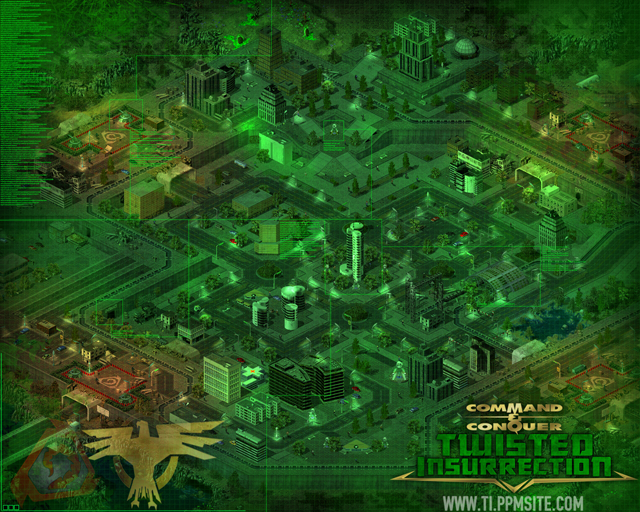


 ) one looks the best, mostly because it is a background, without specifically dominant images. IMO it would be even better if the logos were a little bit less opaque.

