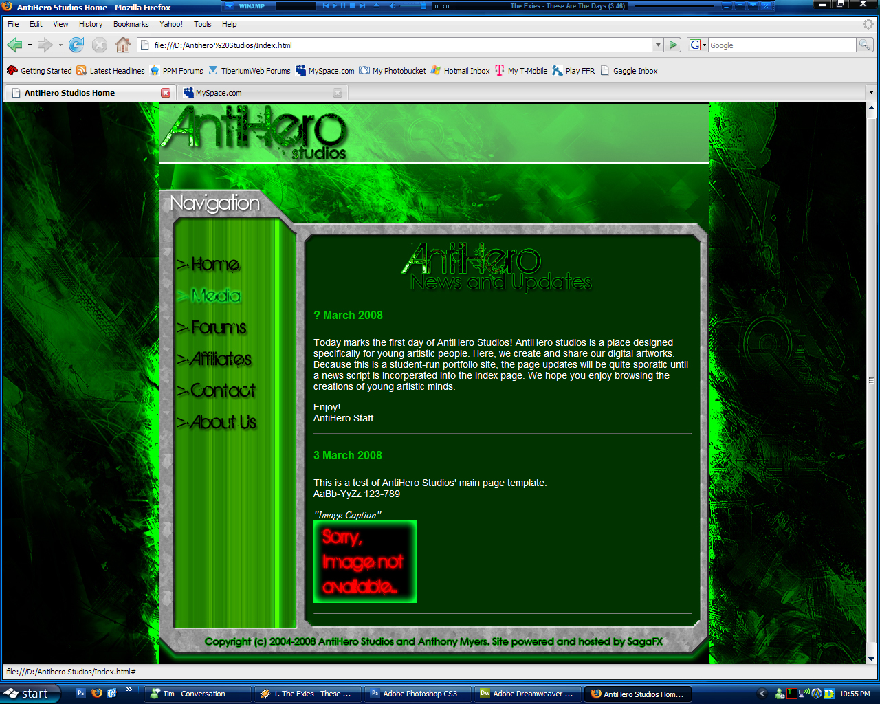
It looks fairly good. I think it would look better if the parts outside of the content area where more consistent with the background. I don't mean in style, I mean in placement. CSS opacity or perhaps different version of the background a la
Complexspiral would work.
Also, I've found that using images for navigation, while it looks cool, is a bitch to maintain. Sure it seems now that it'll be easy to make different images if/when you want another link, but what do you do when your computer screws up, leaving you without your originals, and you can't remember exactly how you did it the first time? You could try to make it look the same, but there's always a problem or discrepancy.
Finally, you might consider using a larger repeating pattern , what you're using right now will be quite obvious with longer pages.
 daTSchikinhed AntiHero Studios Website Mar 4 2008, 04:52 AM
 Team Black Nice image effects here datster, not a bad page. Mar 4 2008, 05:16 AM
 Nod Strike QUOTE (EAShortbus @ Mar 4 2008, 04:55 AM)... Mar 4 2008, 08:29 AM
 jadems I like it, but I am 16, so I don't know if tha... Mar 4 2008, 09:01 AM
 Dutchygamer Not bad Anthony, better then I'll do
Also, pl... Mar 4 2008, 10:16 AM
 Altzan I am 17 and I think it's quite good... and gre... Mar 4 2008, 01:23 PM
 Tore *ignores EAShortbus*
I think the site looks reall... Mar 4 2008, 05:36 PM
 ShDwBoRn QUOTE (EAShortbus @ Mar 3 2008, 09:55 PM)... Mar 4 2008, 08:32 PM
 TSHyper links to windows theme and winamp skin plz
kthnxb... Mar 5 2008, 03:22 PM
 daTSchikinhed @ d2k: I'm not an experienced coder at all. I ... Mar 5 2008, 04:30 PM
 TSHyper Thanks, and i know what WindowsBlinds is
Nice bt... Mar 5 2008, 06:23 PM
 I_Am Nice job DaTS, thats better than the WIP I saw. Mar 6 2008, 10:07 PM
 daTSchikinhed >Here< is a link to AntiHero Studios. It... Mar 8 2008, 11:28 PM


 Mar 4 2008, 04:52 AM


