Help - Search - Members - Calendar
Full Version: Destroy Stuff!
TiberiumWeb.org Community Forums > Off Topic > The Graphics Fridge
daTSchikinhed
So I got bored and destroyed New York City.

I *REALLY* like how it came out. Even my Advertising Design teacher (She's a master photoshopper certified to teach Photoshop) said it was impressive work. biggrin.gif


So, Here it is:
It still needs a little work IMO


Here's the original:
Original


If you want i'll post the .psd for those that wanna see how it was done. smile.gif


Also, post your destroyed stuff here. biggrin.gif
Wess
that is indeed impressive work, nice job daTS.
plz do post the .psd i could learn alot from it.

if u want to add something to it "destroy" the original builings a bit, there a bit to clean imo.
Ixith
saw it on myspace but I figured I'd comment it on here. tongue.gif

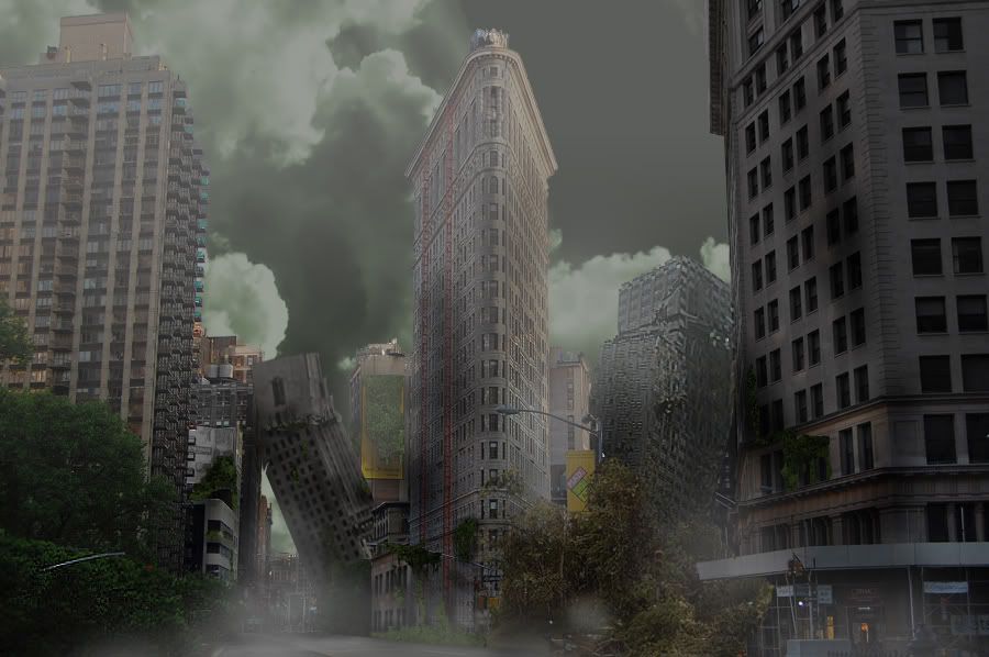
anyways I like it. Though I agree with Wess that the original buildings in the pic still look too non-damaged/ "too clean". I'd suggest adding some random damage to the one on the left and then making the one in the center have like part of the top have fallen off and can be seen on the ground in crumbled pieces.

I might also add that It would be cool to if you made it so all the buildings around that center one are damaged but its somehow decently intact and pristine like and like a symbol of hope in a destroyed city. You could do that easily by making the atmosphere dark with some emphasis of lighting almost as if there is a break in the clouds and the sun is shining on that center buildings that in the wreckage of the city.

but still that is a very good job I would say. Plus the things I mentioned might be quite hard to do and if able to be done would take some serious time and effort.
Anyways great job on this daTS wink1.gif I must say I quite like it.
Team Black
That's a nice job, DaTS smile.gif
jadems
That's an awesome job!
Aro
Yeah, that's cool alright! tongue.gif Nice job!
DeathRay2K
Its far too grey, especially the buildings. Also, the parts don't seem to fit together all that well; they're all lit differently, and it really breaks the illusion.

It looks alright, I know you posted that its only 3 hours work, and I hope you continue working on it and fixing it up.
Crimsonum
The leaning buildings on the right look a bit too blurry to look like they were there originally, and what Prime said at ppmsite, the structures just wouldn't handle all that weight, instead, they would collapse.
ChielScape
ITT: pics that do not obey the laws of physics.
Wess
makes u wonder... gues its photoshop aswell tongue.gif
Click to view attachment
DeathRay2K
That building looks like it's much, much smaller than the one in DaTS's image.
daTSchikinhed
hmm.. 6 floors vs 60 floors.
fail.
Aro
KingByng
Wow it really does look good, every problem I have was posted already by others (the building that's leaning against the other across the street is blurry). But what I want to know is why you chose the Flatiron building instead of a more iconic one like the Chrysler?
This is a "lo-fi" version of our main content. To view the full version with more information, formatting and images, please click here.
Invision Power Board © 2001-2024 Invision Power Services, Inc.