Printable Version of Topic
Click here to view this topic in its original format
TiberiumWeb.org Community Forums _ The Graphics Fridge _ Show Off Your Artwork Here
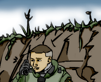
Posted by: Team Black Oct 26 2006, 05:14 PM
Continuing the "pen is mightier than the sword" from the other forum, upload your best art and post it here.
It can be anything photoshop, drawing, MS paint, legos, a mashed potato sculpture, whatever you want.
Just make sure it's decent, please refrain from posting it if you know it's crap.
Here's a pic I drew in , er , math class:
Posted by: Bittah Commander Oct 26 2006, 05:27 PM
Pinned 
Posted by: Team Black Oct 26 2006, 06:20 PM
Hey thanks Bittah
Posted by: Corsair Oct 26 2006, 07:24 PM
Awesome, it's back! Thanks Bittah (and Team Black  )
)
Posted by: daTSchikinhed Oct 28 2006, 03:33 AM
These images are way to hi res for the forum allowances.
http://www.filelodge.com/files/hdd2/4350/concept%20art003.jpg
originally for Odyssey.. they didn't want it.
http://www.filelodge.com/files/hdd2/4350/colored%20plaza%20copy.jpg
Totally sh*ttily coloured..
http://i4.photobucket.com/albums/y124/daTSchikinhed/DropshipScene001.jpg
Big ass dropship
http://s4.photobucket.com/albums/y124/daTSchikinhed/?start=120#imgAnch146
f*ck if I know...
http://i4.photobucket.com/albums/y124/daTSchikinhed/MyArt003.gif
OMGWTFBBQ!!!!1!!111111one ... BOOBZ (not explicit i promise.... Just.. kinda slinky clothing.
http://i4.photobucket.com/albums/y124/daTSchikinhed/DolphinI.jpg
erm... like.. four years ago... I seriously did NOT know i had that in an image.
http://i4.photobucket.com/albums/y124/daTSchikinhed/badkitty.jpg
Drawn by me, Airbrushed by Kat =D
Posted by: WorManiac Oct 28 2006, 08:59 AM
wow! those are very nice drawings DaTS, especialy the Nod Radar. Shame that Odyssey didn't accept it...I could use it for Tiberium Glory...
Posted by: Team Black Oct 28 2006, 08:44 PM
Not bad, dats
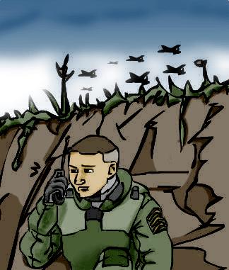
another math class drawing, this is where I go on my vacations:
Posted by: Corsair Oct 29 2006, 12:34 AM
Pretty good Team Black, and nice concepts Dats
Here's what I do when I get bored in Biology...

Posted by: lone wolf807 Oct 29 2006, 03:56 PM
hey dats second last pic looks like gdi ship (forgot name)
Posted by: Stinger Oct 29 2006, 09:06 PM
I drew a girl I know and totally awed her. I love the power of the pen. 

Posted by: Corsair Oct 30 2006, 01:03 AM

Did you submit that in on another site? I think I've seen your drawing somewhere before
Posted by: Stinger Oct 30 2006, 01:48 PM
Yes on tumsun but that forum went dead right after i posted it  , so I reposted it here.
Posted by: Team Black Oct 30 2006, 04:21 PM
Nice work stinger. it's the shine that really brings it to life;
I haven't used photoshop alot, I grew up with MS paint on the Windows 95 (the MLRS on my sig for example).
Corsair nice job as well, even without alot of shading there's enough detail to make up for it.
Usually for me it's the shading that brings it together, though sometimes it just depends on what the drawing is.
Most of my drawing I do during class, so lined paper is what I use most often.
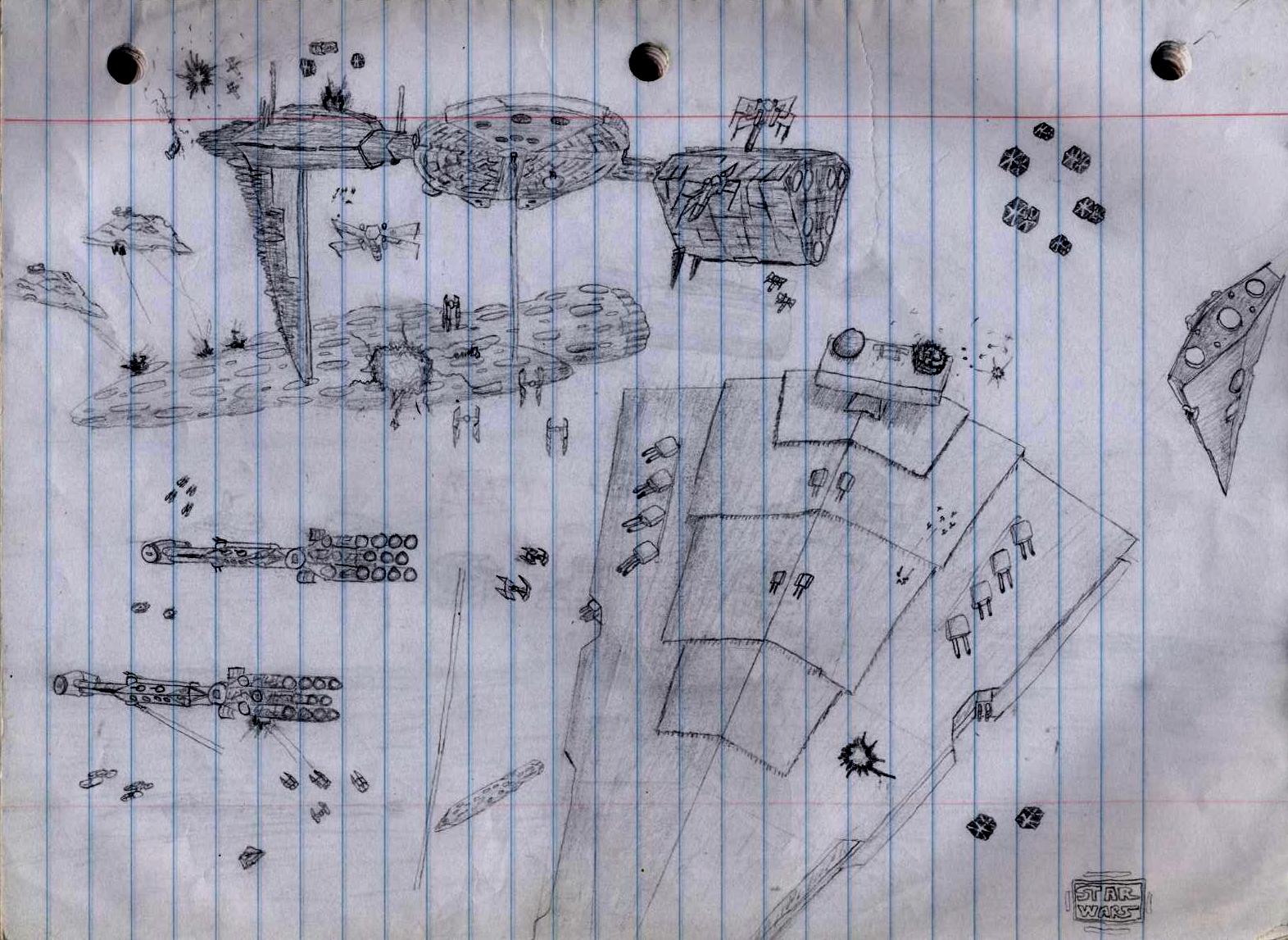
Back in ninth grade I drew these figters alot, I called them "starusters",
this particular squadron is the elite "Mirage Squadron"
In 8-9th grade I started a book about it, though eventually I abandoned it cause it wasn't that good.
The other one is an "advanced staruster", she's landing it at her house after a long day of pwnage.
Posted by: Nintyuk Oct 30 2006, 08:59 PM
my knex mech
Posted by: Team Black Oct 30 2006, 09:03 PM
You're proud of this aren't you?
I must've seen it like ten other times in other forums
Nice job, was it a kit or was it your own idea?
Posted by: Genobee Oct 31 2006, 01:49 PM
Very nice drawings there!
Posted by: daTSchikinhed Oct 31 2006, 07:39 PM
mm.. more...erm.. sh*t n stuff. PLEASE ignore the text... I know it's not the right kind.. but yeah.. My others didn't install until two days ago for some reason. T_T
Good ol' GDI MCV. She's seen better days (notice the bullet holes and rocket mark and Missing TraxGuard)
http://www.filelodge.com/files/hdd2/4350/MCV_art.jpg
Pyramid, anyone?
3 piece signature for PA (now expired)


Con Yard (older version)
AS you might have gathered, I make a sh*tload of stuff on a daily basis.
Posted by: The DvD Oct 31 2006, 10:19 PM
The pyramid rocks...
Posted by: Corsair Nov 1 2006, 03:27 AM
Prehistoric Lizards!
(Dramatic music)


Posted by: Nintyuk Nov 1 2006, 06:43 PM
I must've seen it like ten other times in other forums
Nice job, was it a kit or was it your own idea?
it was a kit but ive cutsomised it tons of times but now its all most back to its orginal setup
if i was better at voxsles or unit making ide make this into a hevy mech for gdi
Posted by: Team Black Nov 1 2006, 08:59 PM
Nice job daTS, what game are the buildings for though? They can't be TS or RA2, Generals maybe?
Or are they not made for a game, just stuff you made?
Looks really good
Corsair I like your style, you should post your tiberium flyer on here from the other forums.
I'm not as adept when it comes to drawing organic stuff, people and animals especially.
I tend to go for geometrical shaped stuff better.
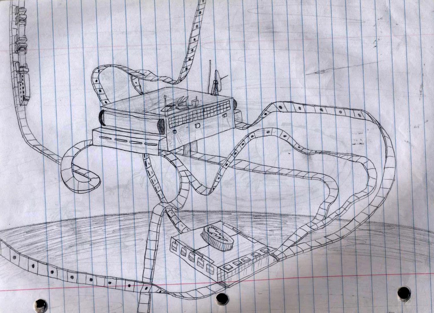
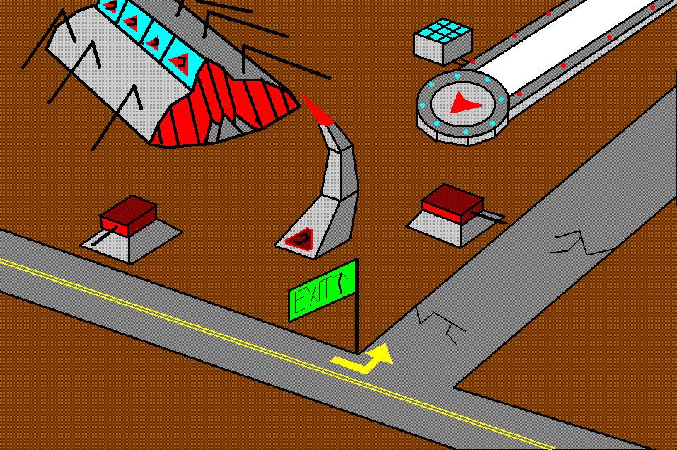
This one I drew in seventh or eighth grade. it's some kind of a space train station, I though the rollercoaster-esque train rails and stuff was pretty cool:
Posted by: Corsair Nov 2 2006, 01:48 AM
Very abstract, I'm not so good at those kind of drawings
Not to say I'm not creative or imaginative
And for the return of the Terran Marine (If it appears grainy on your computer like it does mine, I blame my scanner )
http://img101.imageshack.us/my.php?image=starcraftmarinepq8.jpg
Posted by: ChielScape Nov 2 2006, 01:07 PM
bulletholes look good
Posted by: Team Black Nov 7 2006, 07:06 PM
Here's a picture of a dam The train cars have capacitors in them, so they transport the energy via train (i don't even think that's possible, but I don't care)
This is probably from 8th grade
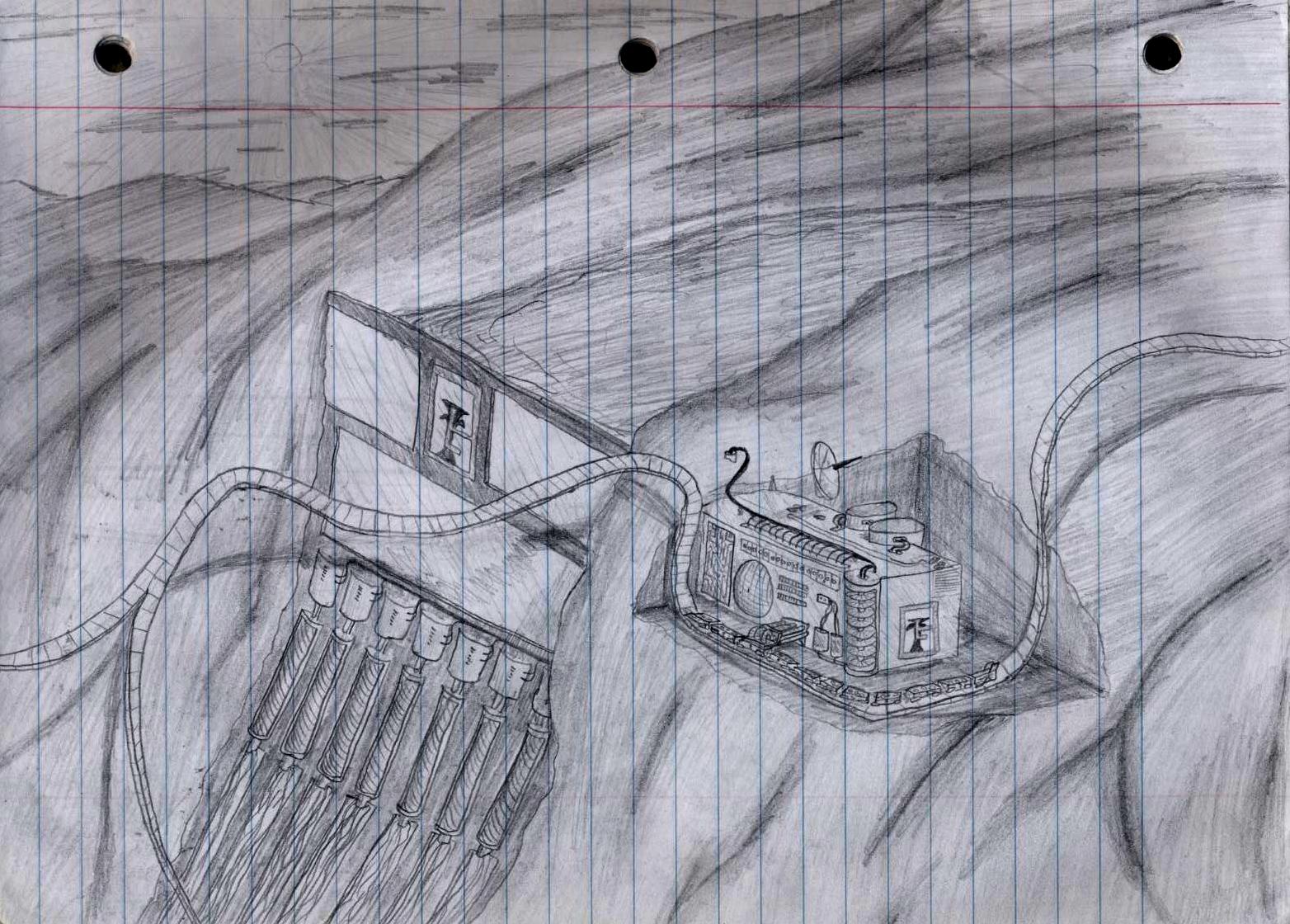
Posted by: Corsair Nov 7 2006, 08:14 PM
This is probably from 8th grade
Heh, its not bad, kind of hard to tell that it is a dam with water behind it but its in pencil so no points taken off
It would be possible to transport it by train... but there's no reason to... nice drawing anyway, innovative
Posted by: Team Black Nov 8 2006, 04:55 PM
Yeah, the shading wasn't totally accurate on that one, though it still gives it some life.
Here's a picture of a monster truck I drew, in 9th or 10th grade.
It also inspired me to make my first voxel, which is now posted in TS graphics

Posted by: Tyler Adams Nov 11 2006, 11:38 PM
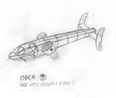
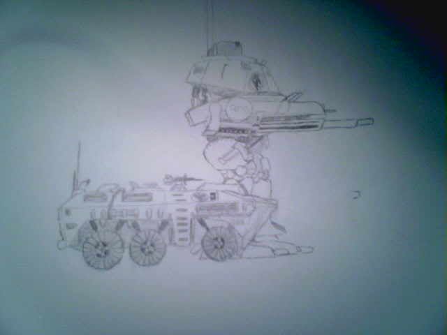
GDI Tiberian Dawn Orca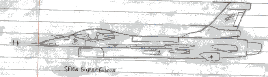
AlkCorp SF16B SuperFalcon
Posted by: Corsair Nov 12 2006, 04:20 AM
Tyler finally made his appearance!
That last drawing looks like your scanner went on the fritz
Posted by: Tyler Adams Nov 12 2006, 05:12 AM
uhh.. yeah.. forgot to set something heavy on the top.
I'll rescan it later.
And a few other things, besides.
:o
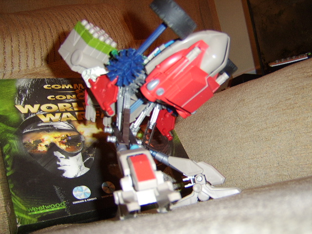
Hmm.. gotta remake my lego Orca Fighter.
Somehow.. 
Posted by: Team Black Nov 13 2006, 04:01 PM
Legos...man, yeah. I made a lego Orca fighter once, long time ago.
I'll see if I can make it again, and post it. We'll see who's is better
I like the drawings, too. Margin doodling?
Posted by: Tyler Adams Nov 13 2006, 08:47 PM
The Orca was in an old(er) sketchbook. Not the one that got me the name of terrorist, a later one.
The SF16 was in a notebook of papers I made from part of a folder & some papers, for.. well.. anything.
The back of that page is math notes. I think.
It's got a bunch of Homeworld drawings, a couple fighters I made up, old USAF planes (F4 Phantom, MiG15 Fagot, A6E Intruder), that SF16.. hm. swords, bows, knives, ect in one page. A Gordon Freeman drawing.. half finished US Soldier.. headcrab.. math notes.. hey, some Spanish. .. health? meh..
Posted by: Team Black Nov 13 2006, 09:07 PM
...here's some recent margin doodling of my own:
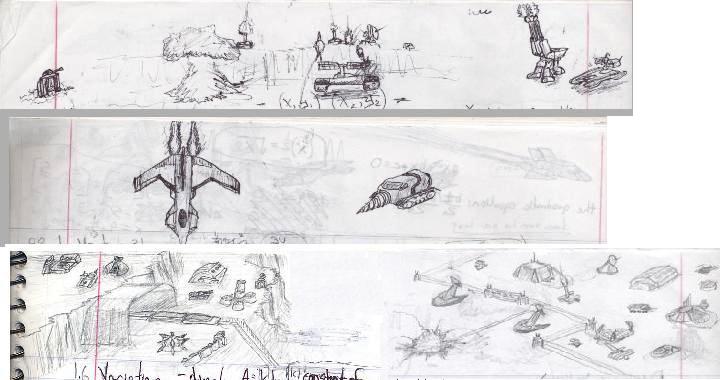
Posted by: Bittah Commander Nov 13 2006, 09:43 PM
Especially the lower sketch is looking interesting
Posted by: Tyler Adams Nov 13 2006, 09:56 PM
Very much.
Posted by: Team Black Nov 14 2006, 02:24 AM
Hey thanks.
That's my first actual drawing of TS ingame (as opposed to just the units, like in the top two...)
I'll see if i can do some more of that for you....
Unless, of course you're looking at my half-cut-off math notes on Direct vs indirect constants. I can tell you more about those too if you're interested...
Posted by: Corsair Nov 15 2006, 01:16 AM
The plane in the middle looks like the Perseus from Freespace 2 (As if anyone recalls/knows that game)
Bottom sketch looks nifty, I like the 'ingame' feel of it
I will post drawings on here eventually... I have yet to actually get myself to set up my scanner though <_< ... Been kind of busy with the whole 'college thing'
Posted by: Corsair Nov 23 2006, 05:26 AM
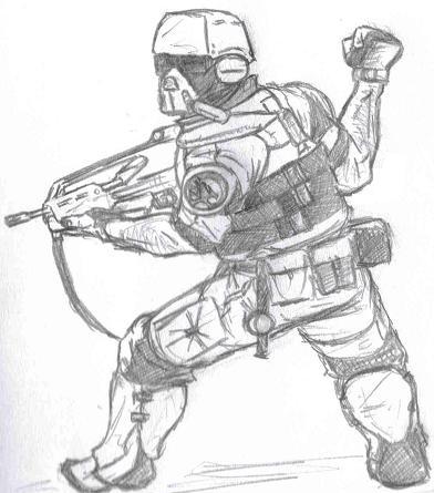
I'm not anywhere near done with this but I figured I would post what I got...
I had the idea in my head of just the cyborg, so the soldier was kind of... hastily drawn just to give the cyborg something to fight with
I probably won't finish anyway

Posted by: daTSchikinhed Nov 23 2006, 07:26 AM
*crack*
dude.. i think that dude's wrist is broken.. for good.
Posted by: Corsair Nov 23 2006, 03:08 PM

Hm, Perhaps that could be a new replacement for the CnC cyborg? Or a lighter/heavier version...
(Considers an SHP)
Posted by: Team Black Nov 28 2006, 07:11 AM
very nice cyborg...that guys ripped, like on steroids!
okay okay Corsair you insist, I'll post some more stuff...
here's all the sigs so far I've made in MS paint for myself, and the giant spaceship that I posted in the picture owning game. Satisied? 


Posted by: Uufje Nov 28 2006, 04:30 PM
Nice drawings
Posted by: Roani52 Nov 28 2006, 04:33 PM
Yea...
Its also funny to see a picture as background, and a tank without texture in the same image.
Posted by: WorManiac Nov 28 2006, 05:41 PM
wish I'd have a good camera to take good pictures of these goo...erm...drawing of mine 
Posted by: Corsair Nov 28 2006, 07:36 PM
Did you post that drawing in the Picture Owning game Team Black?
Seen it before I believe
Posted by: Uufje Nov 28 2006, 08:35 PM
'nuff said.

Posted by: Corsair Nov 28 2006, 09:10 PM
Whoops...
Thanks Uufje :biggrin:
Read it all except that last part 
(Velociraptor and Warcraft 3 ^_^ )
The WC3 one is a little older


Posted by: Team Black Nov 29 2006, 01:01 AM
wow corsair, you and your dinosoars...they rock!
I never got really in to the warcraft series, but even so those guys are really good; lots of detail too.
...oh yeah, and here's a preview of my next sig. I made a mammoth tank for Inzane Krazy just because, and liked it alot so I made my own recolored to TEAM BLACK style and made it mine 
Posted by: Corsair Nov 29 2006, 01:26 AM
Must say, I don't see much MS Paint art and you do it pretty well
I'm not a big fan of the Warcraft series, only game I played was WC3 (Just so you know  )
)
Posted by: Tyler Adams Nov 30 2006, 01:46 AM
I'm not a big fan of the Warcraft series, only game I played was WC3 (Just so you know
)Very true.
217 an important number of yours, birthdate, perhaps?
Posted by: Corsair Dec 1 2006, 04:25 AM
217 an important number of yours, birthdate, perhaps?
Heh... uh... February 17th?

Posted by: Team Black Dec 1 2006, 02:21 PM
Oh yeah, 2/17/88 is my birtday (mentioned it in the Number topic and the happy birthday thread.)
Also a while ago there was a band called "Pax217" that I liked (they broke up though now  ), so 217 then became my favorite number..
Posted by: tetnis shot ninja Dec 7 2006, 12:20 AM
hey guys im back!!!! yeahhhhhhhhhugh. well heres just a pic i drew of some stuff. the main theme is my brothers ex girlfriend who talks to him on the phone constantly. from right as he gets home from school to about 3 in the morning. she doesnt even care what they talk about, i mean half the time she just has him sitting on the phone while she goes off to do stuff. I hate that F-ing Biotch!!!. shes the one named leandra. the other chick next to the spider is my other brothers g-friend and she is deathly afraid of spiders and as i was drawing this a spider started walking towards her and she freaked out. shes the one named salinda. the nazi version on the left was acctualy drawn by my brother after i drew the one in the middle.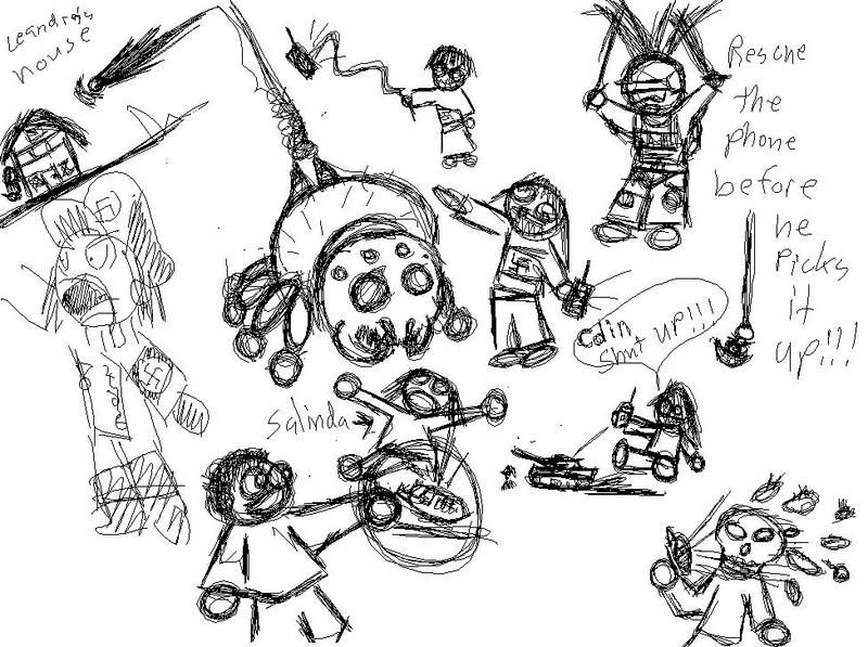
heres another pick.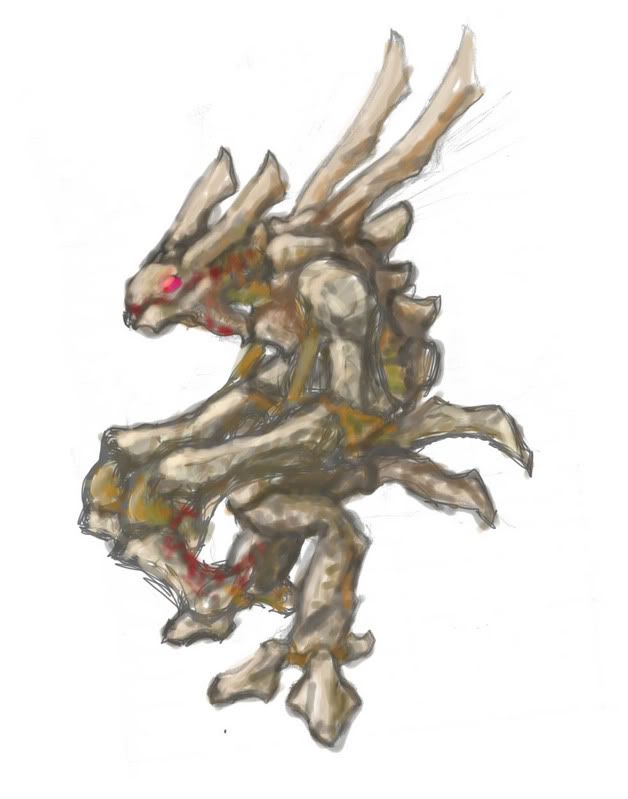
Posted by: Corsair Dec 7 2006, 02:35 AM
'Ey! Welcome back Tetnis, funny first pic by the way
[Deleted drawing]
Posted by: tetnis shot ninja Dec 8 2006, 06:23 PM
thanks for the welcome, and yeah his arm does look a little short but the pic is still cool, your soldiers kick a$$
Posted by: Team Black Dec 8 2006, 07:10 PM
Yeah tetnis shot, I remember you from tumsun, you joined there almost the same time I did. It's good to have another regular poster in this thread, other than me and Corsair
Yer first pic reminds me of "Calvin & Hobbes", back in the day
Good stuff here, MS paint pwns ALL
Yeah I grew up with MS paint on me Windows 95 (I never had a computer to process complex, and $expensive$ programs like photoshop, until recently when I got my laptop).
If you take a look, my drawing style is based mainly off of geometrical shapes (rectangual, triangular prisms, etc), and MS paint draws really good straight lines for that kind of stuff...and ctrl Z is TONS more convenient than an eraser.
Yeah, there's a little bit of disporportionality there, his >>> arm should be longer, and bent more on the elbow.
But hey, I'm not by any means skilled at drawing people...I'll post some later and you'll see what I mean
Posted by: tetnis shot ninja Dec 8 2006, 09:22 PM
heres somthing i did completely in ms paint. all with a mouse no tablet.
http://i3.photobucket.com/albums/y88/TetnisShotNinja/comic/cmd1.jpg
http://i3.photobucket.com/albums/y88/TetnisShotNinja/comic/cmd2.jpg
http://i3.photobucket.com/albums/y88/TetnisShotNinja/comic/cmd3.jpg
http://i3.photobucket.com/albums/y88/TetnisShotNinja/comic/cmd4.jpg
http://i3.photobucket.com/albums/y88/TetnisShotNinja/comic/cmd5.jpg
http://i3.photobucket.com/albums/y88/TetnisShotNinja/comic/cmd6.jpg
http://i3.photobucket.com/albums/y88/TetnisShotNinja/comic/cmd7.jpg
http://i3.photobucket.com/albums/y88/TetnisShotNinja/comic/cmd8.jpg
http://i3.photobucket.com/albums/y88/TetnisShotNinja/comic/cmd9.jpg
http://i3.photobucket.com/albums/y88/TetnisShotNinja/comic/cmd10.jpg
http://i3.photobucket.com/albums/y88/TetnisShotNinja/comic/cmd11.jpg
http://i3.photobucket.com/albums/y88/TetnisShotNinja/comic/cmd12.jpg
http://i3.photobucket.com/albums/y88/TetnisShotNinja/comic/cmd13.jpg
http://i3.photobucket.com/albums/y88/TetnisShotNinja/comic/cmd14.jpg
http://i3.photobucket.com/albums/y88/TetnisShotNinja/comic/cmd15.jpg
http://i3.photobucket.com/albums/y88/TetnisShotNinja/comic/cmd16.jpg
the two people on the outside breaking in are my brother and our friend, and im the one in the house, i kind of did this as just a joke for us three.
Posted by: Team Black Dec 8 2006, 09:35 PM
Dude, that's AMAZING (a little overboard with the guts though imo)
wow I thought I was the only MS paint geek here, looks like I have some competition for the title...
Posted by: tetnis shot ninja Dec 8 2006, 09:44 PM
there can never be too many guts, blood and guts makes good!!!!!!
Posted by: Corsair Dec 8 2006, 10:28 PM
Those are great :biggrin:
Posted by: Uufje Dec 9 2006, 11:54 AM
Yes, it's a bit violent but they look good.
Posted by: area52 Dec 11 2006, 10:01 PM
some shorts of mine
Posted by: Corsair Dec 11 2006, 11:33 PM
Welcome Area52
And very nice drawing of the all mighty Kane
Just finished this one...

Posted by: daTSchikinhed Dec 12 2006, 06:40 AM
Well.. I kinda wanted to delve deeper into standard photoshoppin, with no outside help (IE no outside brushes or the sorts, just stock filters and brushes)..
and I came out with an intresting result.. If you want the .psd, let me know.
I know i knw, it's not exactly marvelous, but I think the edit is pretty cool.
I went from this:
http://i4.photobucket.com/albums/y124/daTSchikinhed/DolphinII.jpg
to THIS: (see attached image)
Posted by: Yoshi Dec 12 2006, 11:12 AM
VERY nice. With the photoshoping, it made the image look more action-packed. :biggrin:
Posted by: Corsair Dec 12 2006, 03:13 PM
Legos FTW
Posted by: Uufje Dec 12 2006, 04:21 PM
Now I see it's Lego
It looks cool anyway. :biggrin:
Posted by: Team Black Dec 12 2006, 05:32 PM
wow, that's an incredible drawing area5Z, you've got to post more stuff here
@ Corsair, nice job as well. First I saw it, it reminds me Lord of the Rings (that, and I'm listening to the soundtrack right now)
@DaTS, legos AND photoshop; that's amazing!
first I saw it, I thought it was the Kodiak...
This one's not anything new, you've probably seen it before in the picture owning game (and tiberiumsun, it was my avatar for a little while). The second I jut inverted the colors and had Kermit battle himself, just for fun...
MS Paint and MS Photo Editor:
Posted by: Corsair Dec 12 2006, 06:49 PM
Yea... I was watching The Two Towers last night and just started drawing :biggrin:
More drawings

Posted by: tetnis shot ninja Dec 14 2006, 06:36 AM
thanks for the comments on the comic thing. and nice pics everyone, just great pics corsair. sorry ive been off for so long, i live with computer hogging ******bags!!!
heres some soldier drawings i did.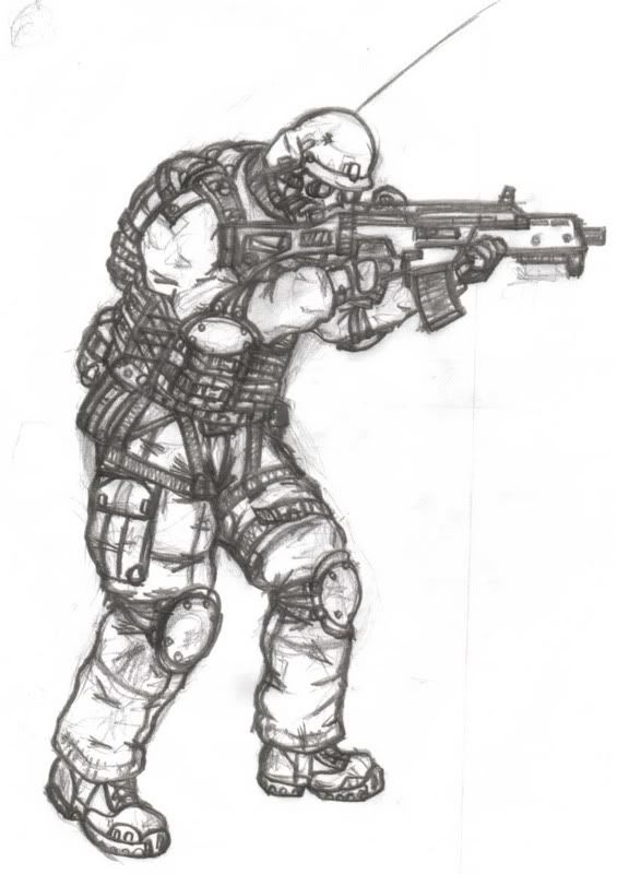
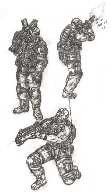
Posted by: Corsair Dec 14 2006, 12:48 PM
Nice, great detail there
Hm... I have a soldier drawing from the back like that one in the middle somewhere on my computer... somewhere... 
Posted by: TShyper Dec 14 2006, 12:51 PM
awsome! i wana see someone do a jumpjet trooper
Posted by: Corsair Dec 14 2006, 06:51 PM
Found it

Posted by: tetnis shot ninja Dec 14 2006, 08:57 PM
thats sweet!!! love it.
Posted by: Corsair Dec 14 2006, 09:22 PM
Well your stuff is pretty awesome, I don't spend near the amount of time on details as you do
Very good stuff
Posted by: tetnis shot ninja Dec 14 2006, 09:57 PM
its just the way your form is, it is simple but the people look great. i shouldnt say simple but not crazily detailed. and your shading makes it look a lot better. on mine, the detail makes it hard to shade.
Posted by: tetnis shot ninja Dec 14 2006, 11:25 PM
heres one of my favorite drawings ive done, just not done with it even though i started it about a year ago. 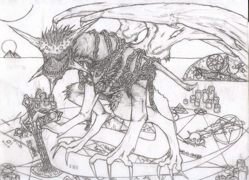
Posted by: Corsair Dec 15 2006, 12:07 AM
Nice, beasties are fun to draw (I'm sure you've seen my dinosaurs )
Did you intend for the demon-thinger to be sitting on its own tail?
Posted by: tetnis shot ninja Dec 15 2006, 12:12 AM
yeah i did see your dinosaurs, they were good. and yeah i did mean for it to be sitting on his tail, and if you didnt notice he is sitting over a giant pentagram, as well as the shape of his head being a pentagram.
Posted by: Corsair Dec 15 2006, 12:23 AM
Yep, I noticed
Always was attracted to the whole "Heaven versus Hell" thing, so kudos here :biggrin:
Posted by: tetnis shot ninja Dec 15 2006, 01:32 AM
thanks, i think that i just wanted to draw a demon dragon but yeah the heaven vs hell idea is really cool.
Posted by: Corsair Dec 15 2006, 01:48 AM
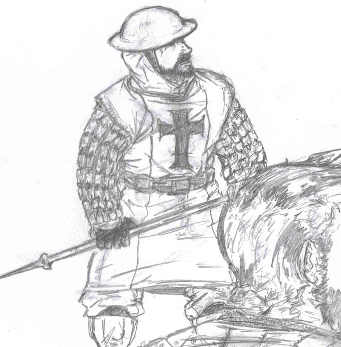
I drew this Armageddon sketch not too long ago (perhaps last year?)

Posted by: tetnis shot ninja Dec 15 2006, 01:54 AM
oh thats sweet, i love that he just cut his arm off. GREAT perspective just nice!!!!
i also drew this wierd pic a while ago, kind of inspired by norse mythology, since i started it in mythology class!!!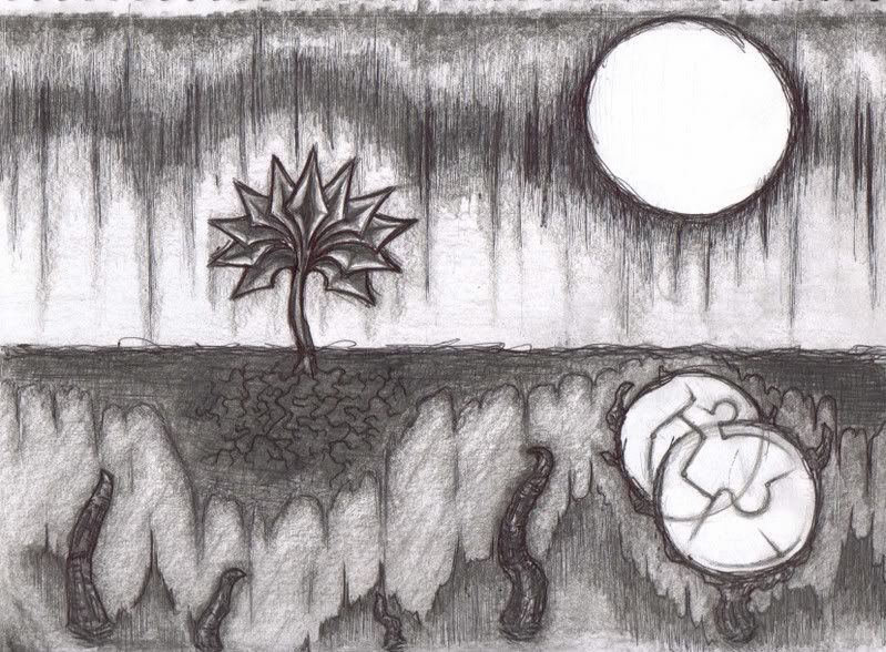
Posted by: Corsair Dec 15 2006, 02:24 AM
It has that abstract look but it makes sense at the same time
Posted by: Corsair Dec 15 2006, 02:57 AM
Yea... I don't know if I will pursue a career in art
I've heard those classes are pretty interesting, I know quite a few people in philosophy (Not so much in Mythology or Astronomy though).
Anyway, to keep our conversation mostly on-topic, I found the sketch I drew before my exam today!

Posted by: tetnis shot ninja Dec 15 2006, 03:01 AM
those guys are awesome, the guy with the sunglasses is freakin great. i also like how you do muscles. thats one thing i like to see in drawings is the muscular features of the things i draw, and you do a great job on people.
Posted by: Team Black Dec 22 2006, 07:26 PM
Okay...no problem. Sorry about that everone.
Here's ome artwork I made in 9th grade Studio Art class.
We used exacto-knives to cut stamps into cube- erasors, then made a picture with them.
Check it out:
Posted by: Corsair Dec 25 2006, 03:38 PM
It's colorful
Posted by: daTSchikinhed Dec 26 2006, 12:38 AM
Some of my latest works.. a bit of photoshopping in the larger one.
::MADE FROM SCRATCH::
Used Terragen. Google it.
Feel free to use in any artwork so long as I'm credited.
also a bit of siggin..
//Edit\\ Also! A background, it's supposed to fit a set width of like 950 or so.. 
Posted by: Corsair Dec 26 2006, 01:54 AM
Hm... maybe I should have said that for mine too? But I guess no one could really use my drawings for anything anyway
Posted by: Tyler Adams Dec 26 2006, 05:35 AM
http://img186.imageshack.us/img186/9344/joingdivs8.jpg
Posted by: Dog Of War Dec 26 2006, 09:00 AM
I finally did it, it took long enough (aprox 3 and a half hours, don't ask), but i did it :biggrin: 
Made it on Photoshop & Image Ready...
Posted by: brotherhood23 Dec 26 2006, 02:39 PM
ahhhhh Sorry I was a little crazy on christmas but I will try to do some artwork IF I GET MY SCANNER
FIXED!!
NEVER MIND JUST FINSHED THIS BIG NOD BASE
Posted by: Tyler Adams Dec 26 2006, 05:53 PM
As Jason T Trevlinsky would say; 'Epic fail.'
HOWEVER.. it isn't too bad for paint.
Posted by: Derox Dec 26 2006, 06:08 PM
The temple if Nod looks like a fat ant...
Posted by: daTSchikinhed Dec 27 2006, 11:35 PM
www.good-tutorials.com
www.n-sane.net
www.deviantart.com
three very good sites for photoshop users.. good-tutorials has LOTS of brilliant, easy-to-use tutorials..
Posted by: tetnis shot ninja Dec 28 2006, 02:21 AM
heres a photoshoped image i did. its a marine sniper about to shoot someone on an alien planet!!!!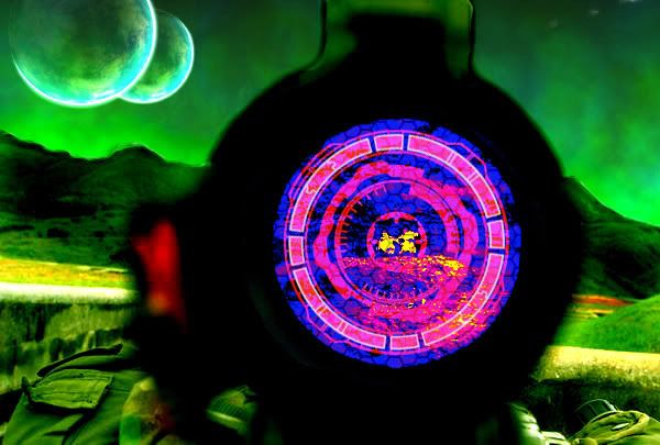
Posted by: daTSchikinhed Dec 28 2006, 02:46 AM
oh wow that's REALLY good.
by the way, what's the font(s) in your sig?
Posted by: tetnis shot ninja Dec 28 2006, 02:56 AM
thats not a font thats from a band. and thanks
Posted by: Dog Of War Dec 28 2006, 03:43 AM
Tetnis that kicks ass.
---
Yeah, i can only really do simple stuff.
I found this tutorial, it's pretty cool i think.
http://www.visualdesigncore.com/tutorials/photoshop/Cloaking-Effect/
Posted by: Team Black Dec 30 2006, 09:19 PM
Tetnis shot that's really good. It's good to see people posting GOOD artwok here still.
Yeah, there's alot of nonsense being posted here, I'd appreciate if a mod could clen it up a little...thanks.
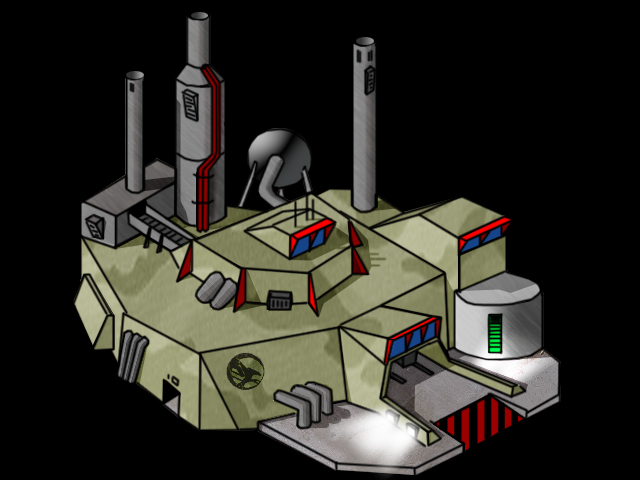
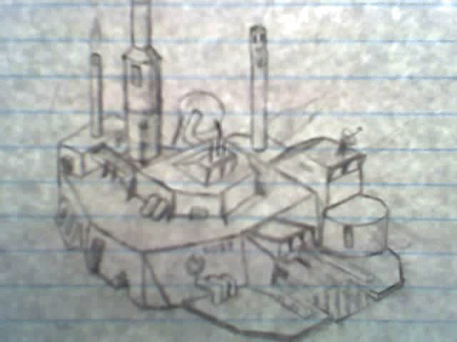
More artwork from a few years ago. Nothing really special, but I stil think it's cool...
Posted by: daTSchikinhed Dec 31 2006, 04:43 AM
looks cool but erm... what is it?
GDI MCV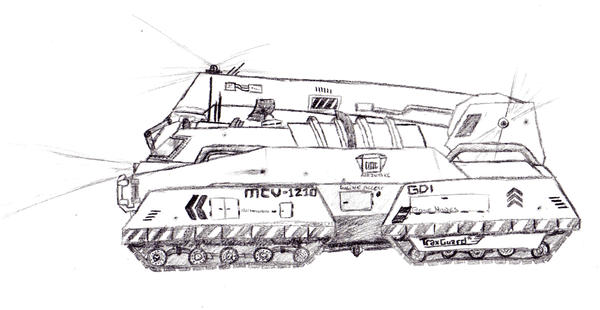
PA Thermal Power Plant Concept.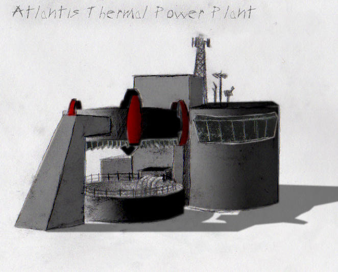
Posted by: Dog Of War Dec 31 2006, 04:22 PM
Deftones Wallpaper.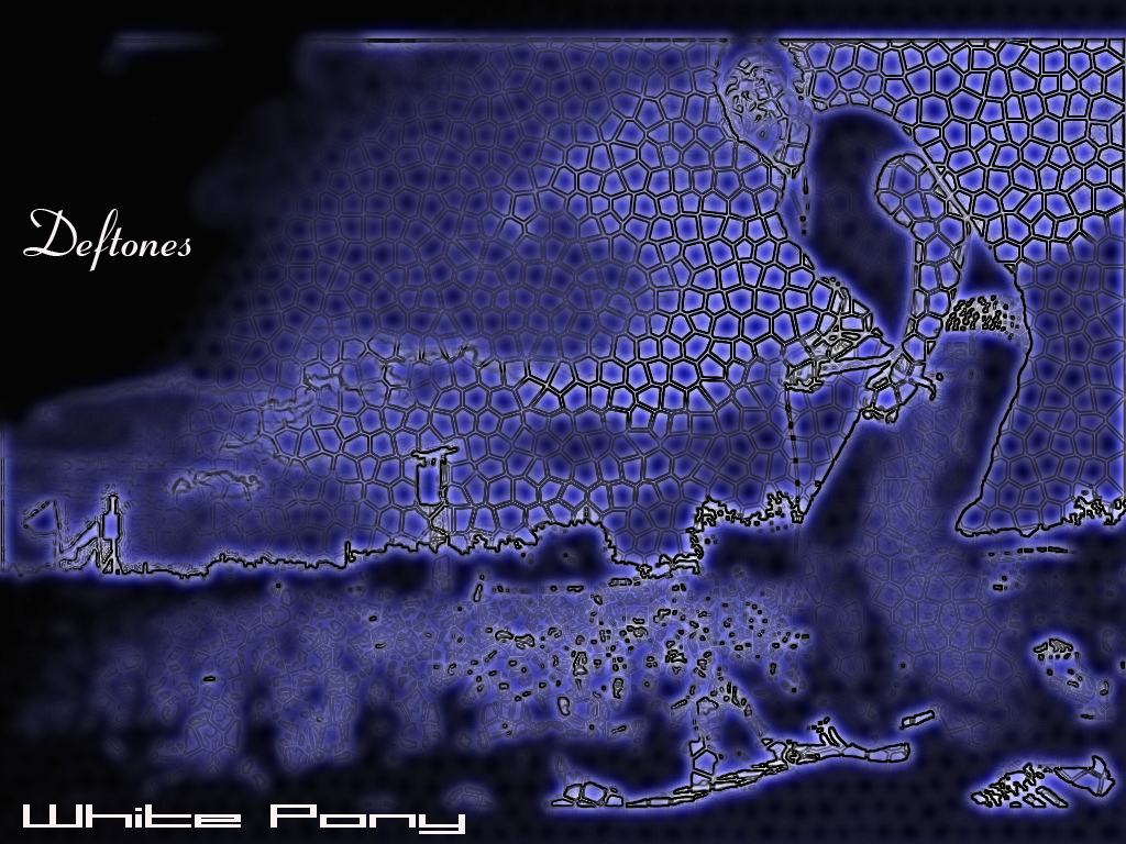
Posted by: Team Black Dec 31 2006, 07:47 PM
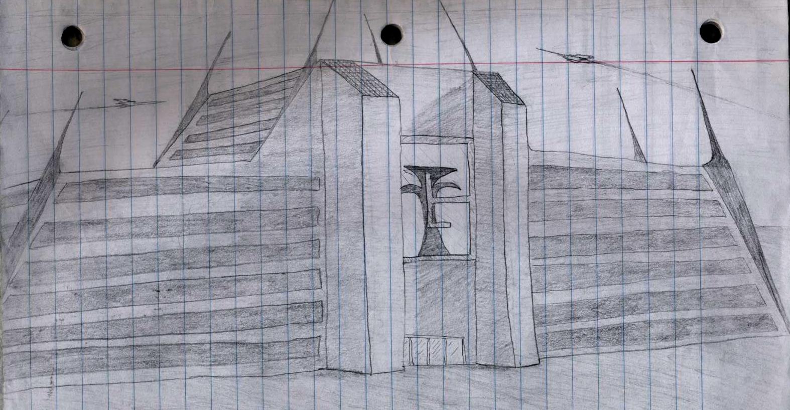
Thanks dude (I didn't know you were a mod??)
Yeah that last drawing is some building I made up, not really good but it was all I could really get posted at the time...
Your stuff is really good, thst second one, the power plant, was that done with oil pastel?
Posted by: daTSchikinhed Dec 31 2006, 11:25 PM
I was promoted last night.
no.. drawn and shaded in pencil and scanned in and coloured in photoshop.
Posted by: Corsair Dec 31 2006, 11:31 PM
Looks good, I like the way you colored it
Posted by: daTSchikinhed Jan 1 2007, 07:34 AM
heh thanks. the shading was the hardest part.. either that or colouring the turbine fins.
Posted by: Dog Of War Jan 2 2007, 05:37 PM
Hotsuma (from Shinobi on PS2) Signature
Doesn't really look right though :confused:
Posted by: Corsair Jan 2 2007, 08:32 PM
Would look better if it blended together but it goes from "Neon Lights" to this scratchy looking figure in the middle... if you get what I'm saying
Posted by: Dog Of War Jan 2 2007, 10:02 PM
Hm not really, I'm going to try make it look better anyway. Probably better if just start over

I only really know what I've learned on Photoshop Tutorials, and that's not a lot.
Posted by: Team Black Jan 7 2007, 07:32 AM
Yea, I'm kind of with Corsair...then again, I've never really explored the depths of phtotshop just yet
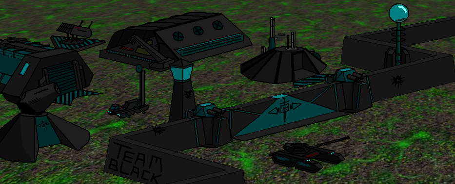
I'm an MS paint person, myself... this is originally from that other thread, but I also wanted to post it here with the rest of the GOOD artwork.
Posted by: daTSchikinhed Jan 10 2007, 07:01 PM
my only complaint is with the tesla coil.. this is all GDI stuff.. but not only is it not from TS, it's like the 'bad guys' weapons in RA2... It's like giving GDI an Obelisk of Light and saying that it's proper.
Posted by: Nintyuk Jan 11 2007, 07:33 PM
its team blacks side he can have what eva he wants in it :confused:
Posted by: Team Black Jan 11 2007, 11:42 PM
if you take another look, the buildings I used are pretty much used in both sides, except for the vulcans (gdi), SAM (Nod), and I gues you could argue the gate looks a little noddish. The artillery is the one I made from my other sig. If I'd put the obelisk in, it wouldv'e made it appear too much like a nod base, when it is in fact, a "Team Black" base. So instead I put a tesla coil in, just to change things around a bit.
Posted by: Dog Of War Jan 27 2007, 01:24 AM
I like where you put 'Team Black' on the wall, looks like graffiti.
Posted by: Nods Viper Jan 27 2007, 02:44 AM
Well Team Black, i really like your signiture.
How you managed to do that with M.S Paint i have no idea.
Well done...
I'm afraid i have not got a scanner, otherwise i would upload some of my pictures.
Posted by: Dog Of War Jan 29 2007, 06:21 AM
Tekken dude (forgot his name). Text is pretty plain and the background was rather annoying, i just don't think it looks as good as it could be 
P.S. Pay no attention to 'Seizure Man', my name on another forum.
Posted by: Disturbed Feb 2 2007, 05:45 PM
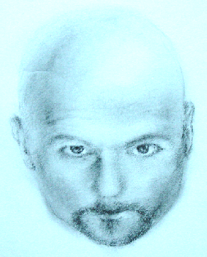
Ok then, i drew these pictures a long time ago, heres hoping you like them.
This was a young female with a choker on, a little wierd yes, but it had a meaning at the time, i just do not remember what that meaning was present day.
This is a picture of a girl i drew a long time ago, i beleive i've uploaded this to quite a few websites before, including revora.net.
Hope you like them.
Posted by: Corsair Feb 2 2007, 09:48 PM
I figured I may as well put it here too, why not

Posted by: cdmt Feb 3 2007, 05:17 AM
That's an awesome looking scout vehicle. The front though looks really vulnerable. When you voxelize it you should cover them with a vent or something. I am also making some hover tanks. Although it will take me awhile to finish them since I am extremely busy right now. By the way Happy Birthday!
Posted by: Lightstorm Feb 5 2007, 04:36 PM
well i made my sig myself, i made this cute little orca.

Posted by: Team Black Feb 5 2007, 06:38 PM
@Disturbed - drawing is good (Those huge anime eyes really creep me out though )
@Corsair - very good drawing, as always. I don't know though... those front hover-thingers look a little odd.
@ lightstorm - that's not too bad ("cute", ehhhhh) , it might even make an OK voxel I think. I'd lose the rotor- blade on the top though
OK time to post some stuff from my archives. Nothing too special, this is a pen drawing I did in 9th grade i think.
This is the "Sigma Squadron" - it was actually my friend's idea, I just drew it for him...
Posted by: Corsair Feb 12 2007, 01:38 AM
Yea... that's right... Werewolves > Vampires
I probably could have done better on the head but it was an odd position

Posted by: Aro Feb 12 2007, 01:44 AM
Corsair, define better for me. :blink:
I don't know how that could be better, its incredible.
Posted by: Wes.com Feb 17 2007, 07:28 PM
here is something i made today, my verry first wallpaper :biggrin: 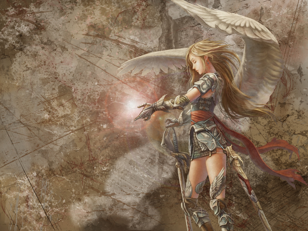
Posted by: Lightstorm Feb 17 2007, 09:52 PM
thats amazing! how did you make it?
Posted by: ChielScape Feb 18 2007, 06:59 AM
plz tell me you have a 1280x1024 version ready, its sooo awesome! me wants!
Posted by: Aro Feb 18 2007, 07:05 AM
G Is his first initial. :wink2:
Also, i like that wallpaper too, just i REALLY like my current one, so i wouldn't change.
Nice work guys. :biggrin:
Posted by: tetnis shot ninja Feb 18 2007, 07:12 AM
here you go people!!!
just got bored.
"catch ya on the flip-side"
Posted by: Aro Feb 18 2007, 07:16 AM
Armoured Core 2 Another age?
I Love that game. :biggrin:
I don't have anything i've created besides a few crappy signitures
But oh well, i'll soon have something.
Posted by: Wes.com Feb 18 2007, 12:39 PM
I want 2 know also...
photoshop: the possibilities are limitless :wink1:
and here is a bigger version for those that want it.
could be that there is some quallity loss.
Posted by: Wes.com Feb 18 2007, 01:08 PM
two more sigs 
Posted by: tetnis shot ninja Feb 21 2007, 05:47 PM
i was working on a pic before but never finished it, how do you think it is so far?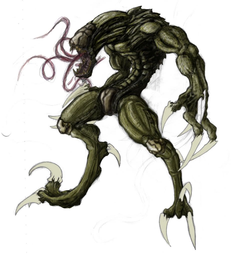
Posted by: El D34dlyto Feb 21 2007, 06:23 PM
""
I'm left speechless.
Posted by: tetnis shot ninja Feb 21 2007, 06:26 PM
well thanks!!!!???!!! i guess that means you like it.
heres a quick pic i made!!!
Posted by: daTSchikinhed Feb 22 2007, 02:25 AM
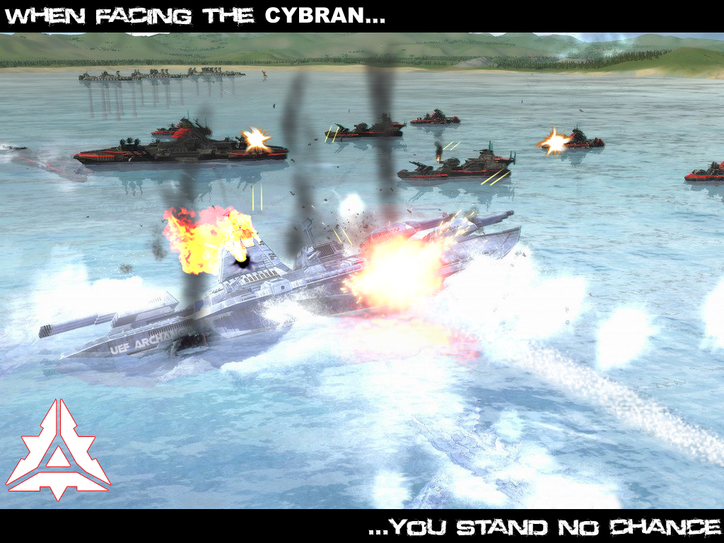
I did some heavy editing to this image... I am infatuated with the Cybran architecture. It has uncanny resemblance to NOD
Posted by: tetnis shot ninja Feb 22 2007, 02:26 AM
what are cybrans from?
Posted by: Corsair Feb 22 2007, 02:28 AM
They're from Supreme Commander, right?
By the way, awesome new additions Tetnis, I like the nuclear fallout one you added, it definitely caught my eye :biggrin:
Posted by: tetnis shot ninja Feb 22 2007, 02:33 AM
oh that new game that just came out.
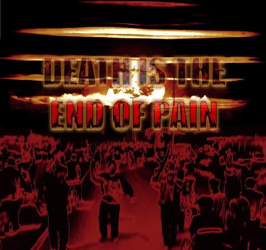
thanks. i only took about 2 to 3 minutes on that one but yeah anything with a nuke going off is an eye catcher. i was making it for a class assignment. i need some text to it though. i was thinking something like "death is the end of pain".
Posted by: Corsair Feb 22 2007, 02:39 AM
Yea, I saw the nuclear weapon... then I looked at the people and I saw that one guy holding an assault rifle or something
So... obviously... they're not as afraid of that nuke as they should be
Posted by: tetnis shot ninja Feb 22 2007, 02:42 AM
that was hillarious. i was just thinking that it went off at that moment and it was just, you know "to late!!!"
Posted by: Corsair Feb 22 2007, 02:46 AM
Hm, yea that too
What I was thinking was that it was a group of terrorists or something, but it could just be a chaotic moment and the picture taken right when a nuclear missile was going off
Posted by: tetnis shot ninja Feb 22 2007, 02:49 AM
yup innocent peopl!!!!!
i really just used this image 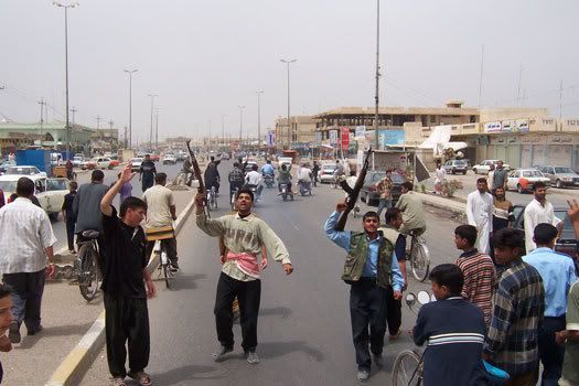
Posted by: Corsair Feb 22 2007, 03:06 AM
Well, it's good that you fixed it to so you can't tell anyones nationality... wouldn't have been quite as good if you had a nuke going off in the background of that original picture
By the way, are you still trying to figure out what kind of text to use?
Er... I guess your looking for a caption?
Posted by: tetnis shot ninja Feb 22 2007, 03:38 AM
yeah you are right. it was supposed to be a poster thats trying to tell people something. or atleast thats how the assignment is explained. thats why i need text. and not so much the font but what it says, then i have to use photoshop to change the way the text looks to portray the message.
here you go, is it good now!! which ones better?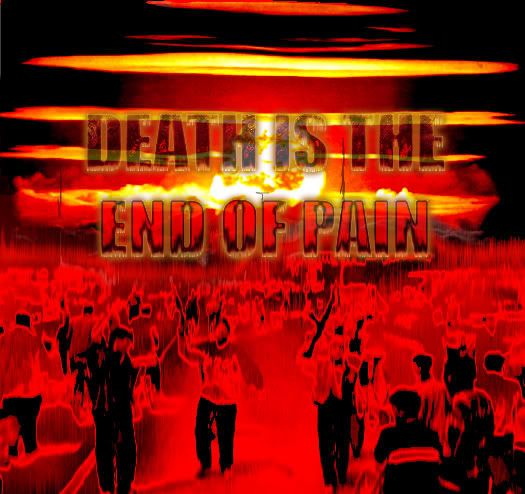
Posted by: Corsair Feb 22 2007, 01:15 PM
I think the first one looks better
Posted by: tetnis shot ninja Feb 23 2007, 09:29 PM
thanks for the comments
heres another pic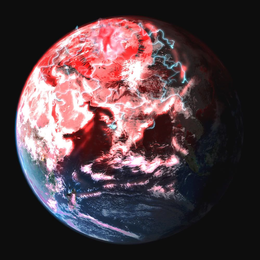
Posted by: Corsair Feb 23 2007, 10:12 PM
Hey, it's Earth in 50 years
Posted by: tetnis shot ninja Feb 23 2007, 10:25 PM
exactly!!! well i guess by that time ill be too old to care.
just thought this would be funny after seeing the quote e=mc2 on wikiquote!!!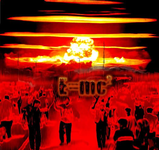
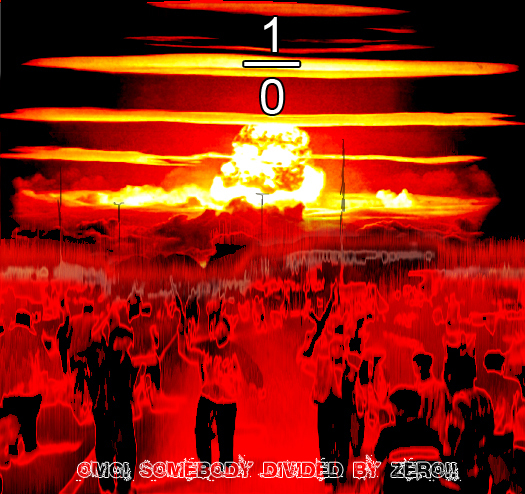
Posted by: daTSchikinhed Feb 24 2007, 05:06 PM
or just put
1 over 0....
and at the quote from one of the guys "OMG SOMEBODY DIVIDED BY ZERO!"
EDIT: like this.
Posted by: Lightstorm Feb 24 2007, 08:28 PM
heres another pic
that looks like the earth when it gets pwned by the drej in Titan AE
Posted by: tetnis shot ninja Feb 25 2007, 01:27 AM
@ dats: hahahhahaahaha, yeah that could work too.
@ lightstorm: yeah it does. i haven't seen that movie in so long but I kind of remember that.
Posted by: tetnis shot ninja Mar 8 2007, 03:14 AM
heres another pic i did not done yet though.
wadya think of it?
Posted by: Team Black Mar 8 2007, 05:03 AM
Wow that's really good TSN. 
Is that...pencil + photoshop?
Posted by: Corsair Mar 8 2007, 05:09 AM
Hey! That aliens got a belly button!
Really good, as usual
Yea, I'm curious as well, how do you go about coloring it like that? Or is that a secret :cool:
Posted by: tetnis shot ninja Mar 8 2007, 10:03 PM
that one was all done in photoshop, unlike most that i do where it starts out pencil and then i scan it. and thanks.................. yeah, you dont see too many aliens with a belly button, or do i and i just dont notice it!?!
Posted by: Corsair Mar 11 2007, 03:24 AM
Well, voila
Nowhere near done; the head and shoulders are all I've finished so far

Posted by: VEFbl4 Mar 11 2007, 04:46 PM


Some of my old artwork...
Posted by: Team Black Mar 11 2007, 05:36 PM
this is the kind of stuff I have nightmares about
still though, gj dude
Posted by: Corsair Mar 12 2007, 02:58 AM
That first alien/monster looks sad, of course, I'd be sad if I looked like that myself 
Posted by: tetnis shot ninja Mar 12 2007, 05:26 PM
corsair i dont know how you do it. all the faces you do are great, real nice job on the scar. and VEF nice work too. great coloring on the third one. and yeah id be sad too if i were balding!!!
Posted by: tomb Mar 12 2007, 06:34 PM
Here's something I made a while back. Just some MS Paint + Paint Shop Pro X.
And here's something I made after that.
PS - the first image will become the background of my revised website.
Posted by: Corsair Mar 12 2007, 06:52 PM
I think it looks a lot better on the paper, the scanner really brightens up everything... and I hate that

Posted by: tetnis shot ninja Mar 12 2007, 07:01 PM
hey tomb nice pics, really like the first one, but for some reason i thought it was from the red alert opening movie before i saw you sead you made it.
corsair, if that image looks worse than the original then the original must be damn good. as for the brightening thing, are there any settings you can change on the scanner, i wouldnt really know considering mine scans fine but messing around with it might help.
Posted by: Corsair Mar 12 2007, 07:34 PM
Well, it's not that much better, it just gets rid of a bunch of small/light details that really brings the drawing together even more... but the scanner's light practically erases it
Posted by: Yoshi Mar 24 2007, 09:06 AM
Yeah yeah yeah, bag on me for drawing anime. But what can I say? I animate a whole lot easier with it (excluding stick figures and less detailed drawings).
Posted by: Corsair Mar 27 2007, 03:40 PM
That guy has an 'X' for a navel
It's not bad, as long as you don't end up making some anime that's as outlandish as most of the other ones out there
Posted by: Team Black Mar 27 2007, 04:27 PM
LOL I think that might be the cursor?
GJ **YOSHI**
I like it (though yea anime-eyes still creep me out )EDITED

Posted by: tetnis shot ninja Mar 28 2007, 05:07 PM
yeah its not bad but im just not into the whole anime thing.
heres another pic i did for my photoshop class. were supposed to make a cd cover and thats what it is. i wouldnt ask what it is because its just the random stuff you would find on a cd cover i guess.
Posted by: ChielScape Mar 28 2007, 05:28 PM
)are you by any chance feeling ill?
Posted by: Team Black Mar 28 2007, 06:30 PM
every time I look at your sig! :

j/k :tongue:
OK here's the ipod ad I made some time ago, (this time in png and not crappy jpg)

Posted by: Corsair Mar 28 2007, 07:28 PM
Hm, was his right foot covered by something? Looks kind of like you had to make him a new leg
Posted by: Yoshi Apr 11 2007, 01:04 AM
The group grows bigger. There's still 5 more characters out so if the dude on the left looks out of place, it'll be fixed later on.
Posted by: -=FF=-Thundgot Apr 11 2007, 12:58 PM
Had to mess myself in here, hehe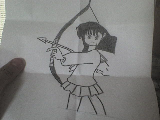
(P.S: Its a copy so thats not the real picture I drawn...My art teacher got it )
Posted by: daTSchikinhed Apr 12 2007, 09:45 PM
OMG HUGE INDEX FINGER OF DOOM!
sorry, couldn't rstrain myself.
You should try and improve your skills.
If you try hard enough, you can accomplish something like THIS:

Oh and your sig is entirely too high. Reduce it's hight by 100 pixels.
Posted by: Yoshi Apr 13 2007, 06:20 AM
I RETURN! Here's a drawing I did of my friend. Too bad my other drawing didn't get any comments, unfortunately.
Posted by: Corsair Apr 13 2007, 06:20 PM
The coloring is pretty good
I don't really know what to say about the head/face, I think your going for the anime look but... from what I recall, your not trying to go for that style at the same time?
Posted by: Yoshi Apr 13 2007, 07:32 PM
It's true that I don't like anime, but unfortunately, this has been the way my drawing style has been even BEFORE I started hating anime. My hands are too used to drawing in this way rather than changing to a completely new style.  Although, I try to stay away from most stereotypical anime things like oversized busts to the HUMONGOUS-GOING-TO-EAT-YOU eyes (even though my previous picture contradicts it I just noticed) and over used anime facial expressions.
Posted by: Corsair Apr 13 2007, 10:07 PM
Or this
(If Dats is going to boast, why can't I?
 )
)
Posted by: daTSchikinhed Apr 14 2007, 12:42 AM
zomg the shading is AMAZING!
Posted by: Corsair Apr 14 2007, 12:54 AM
I could have sworn I already posted this on here before 
Posted by: Team Black Apr 14 2007, 03:38 AM
both DaTS's MCV AND Corsiar's marine were posted before, on the first page I think XD
Posted by: daTSchikinhed Apr 14 2007, 08:06 PM
Posted by: Yoshi Apr 16 2007, 03:11 AM
Flash makes you the most laziest piece of crap ever. I draw more on Flash than on hand. But if you want to improve, it all takes time. Keep drawing, and keep studying other drawings if you have time.
Posted by: Corsair Apr 17 2007, 03:30 AM
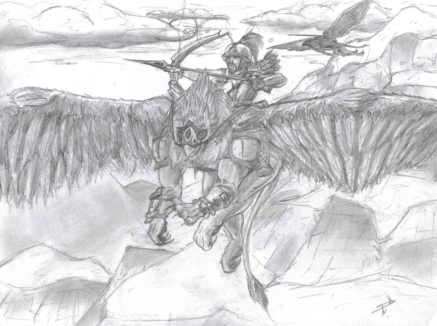
Yea... so... I was bored... and I felt like drawing gryphons...
Posted by: Morgo Apr 18 2007, 10:25 AM
Yes i finally got it the size i wanted it. Took me a while but i got it 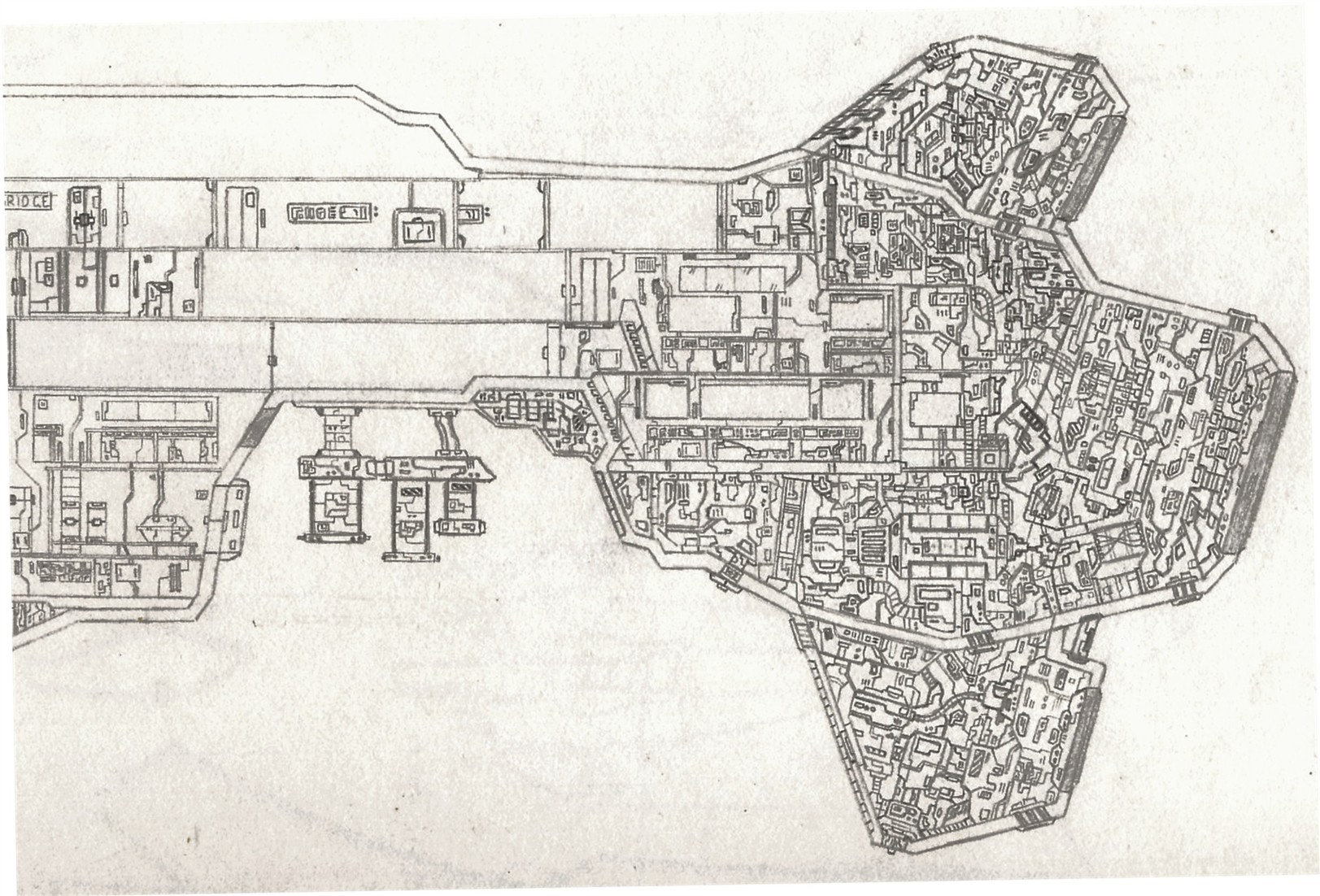

Sorry if they're too large i tried making them smaller but it wasnt working properly
Posted by: Corsair Apr 18 2007, 09:43 PM
Well, they definitely have a lot of detail, but that much detail is sort of a turn-away for me
At first glance it looks more like you were drawing the outer hull of the ship
Posted by: Team Black Apr 20 2007, 03:09 AM
a well- detailed cros section. Nice work!
all the lines are straight; did you make this on a drawing board then?
Posted by: Morgo Apr 20 2007, 06:25 AM
Hey thanks
Nah i didnt use a drawing board its just in my artbook.
Most of the straight lines are just using a ruler like for the decks and stuff
although i reckon i would draw much better if i did use a drawing board
Ill put some of my other drawings that ive been working on up soon
Posted by: -Inuyasha- Apr 21 2007, 09:45 AM
school culture week was this week, so I had to draw something..
And this is one of the pictures I drawn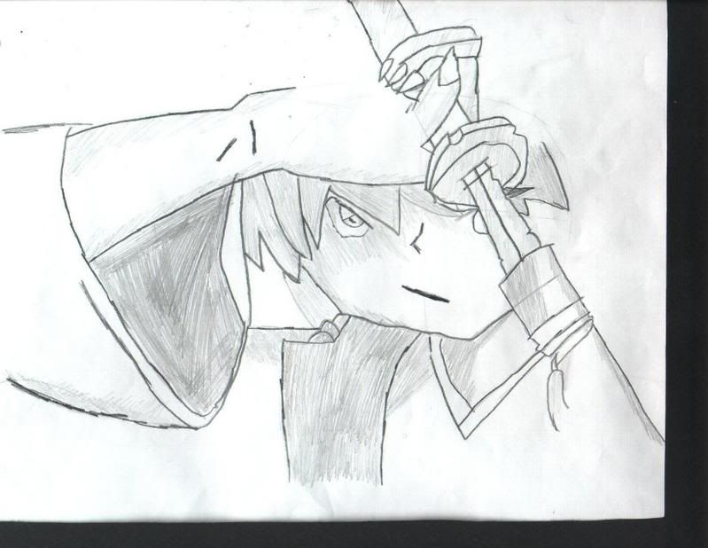
Posted by: Corsair Apr 21 2007, 04:50 PM
You should put one of those decorate helmets on the samurai, it would take up the rest of the picture and give the person looking at the drawing some eye candy
And tell him to cut his fingernails, they're a little point
Posted by: tetnis shot ninja Apr 25 2007, 07:47 PM
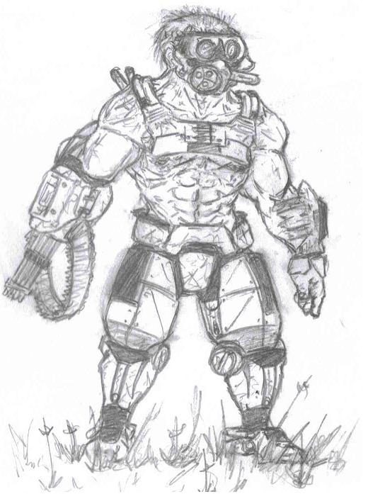
well i havent posted in a while but i havent been drawing much lately. heres just a pic im actually working on. just thought i should show it in case i never take the time to finnish it like most my pics. its a picture of a Nod sniper.
Posted by: Corsair Apr 25 2007, 08:51 PM
Ha ha ha, holy sh*t thats awesome
Posted by: tetnis shot ninja Apr 25 2007, 09:17 PM
thanks............. but i dont get what was funny?!?!?!
Posted by: Corsair Apr 25 2007, 10:14 PM
How unbelievably better you are than me at drawing and coloring that kind of stuff
I mean, that Nod Soldier is just insane
I suddenly feel inadequate, I must draw SOMETHING!

Posted by: tetnis shot ninja Apr 25 2007, 10:28 PM
WHAT? i dont get it. all the soldiers you draw kick ass. our styles of drawing are different so i wouldnt say mine was better. and i suck at coloring, id bet that if you tried you would get better.
Posted by: daTSchikinhed Apr 27 2007, 04:29 AM
Okay, so i did a detailed drawing of a Tiberium Refinery.... and my effing scanner crapped out. I keep getting "EPSON Scan cannot be started. Please use the Troubleshooting Assitant to solve the problem." It doesn't work, i've tried reinstalling the drivers, putting the USB in all hubs and ports, making sure it was on, everything... it just refuses to work. So i took a picture with my phone... opened it and fixed it up in photoshop. Note that all lines, like on the paper, were drawn by hand. I have an animated .gif to show the conversion proccess.
Posted by: Yoshi Apr 27 2007, 05:38 AM
I absolutely LOVE IT. Too much for words. It's that awesome.
Posted by: gufu Apr 28 2007, 03:30 AM
I like the way it translates... but the final result is a bit too cartoony...
Posted by: Team Black Apr 30 2007, 12:00 PM
Nice work. I wonder what a mod might look like if you did make the graphics look like that; something like a "cartoon TS"
Might be interesting, but I woldn't do it
Posted by: daTSchikinhed May 1 2007, 04:26 AM
lol no... that's why it's concept art not a real mod piece.. It would need a serious overhaul to be mod-worthy.
Posted by: Corsair May 1 2007, 02:07 PM
Heh, cartoon TS
It's buildup goes from the pencil wireframe to the colored, detailed buildings
That would make a mod so much easier
Posted by: Sir Modsalot May 2 2007, 04:10 AM
daTS has a sexy refinery there. I like the paper-to-program transitional GIF, especially.
Posted by: Yoshi May 2 2007, 06:42 AM
New work from me. I redrew a drawing that I haven't drawn in almost a year. I like how it turned out. It's a lot better than how I used to draw her.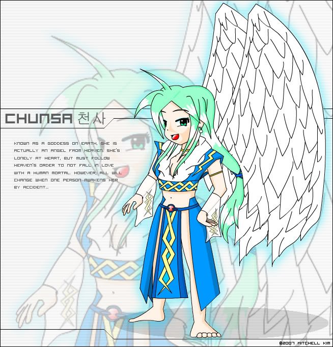
Posted by: Wes.com May 2 2007, 06:17 PM
here is one great wallpaper, not my making tho, but i wanted to share it with ya all
Posted by: daTSchikinhed May 2 2007, 10:29 PM
wow... that's...
holy crap wes that's pretty f*cking awesome.
Odd question, but do you mind if I play around with it some? I have a couple ideas of my own lol. It's all your work, and i wont publish it.
Posted by: Corsair May 3 2007, 12:31 AM
He didn't make it
Posted by: Wes.com May 3 2007, 03:31 PM
indeed, but this one i did make
i lost the background tho because of what happend last week, it is all that was left, its ok but it was a work in progress.
now to make one for Nod.
Posted by: Corsair May 3 2007, 04:44 PM
That looks awesome
Posted by: Yoshi May 4 2007, 09:41 AM
Here's another one in the making. It's a large image, I know, but oh well. Took me about 9+ hours just drawing the thing. Drew it all with a mouse in Flash and nothing else. So far, it's only in "ink" stage so there's no color... yet. If you haven't taken the hint, these (meaning more than just the 2 I showed you) are all characters in an old storyline that I'm still working on with short bios. I screwed up drawing the boosters in the back, but they looked nice regardless of the angle screw up.
...he's also not a robot in case you were wondering and no, this is not DBZ inspired (I hate it when people keep saying that just because this guy can shoot out a ball of energy from his palm, it's inspired from DBZ).
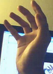
EDIT: Also, in case you were wondering, I confirmed his pose as accurate. I actually did it in person, as I use myself as a model to draw people and poses to ensure their accuracy. I took a picture of my hand (as seen from the right of the drawing) when I started doing that part of the pose.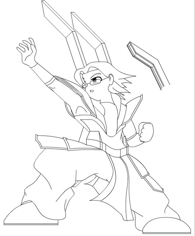
Posted by: ChielScape May 4 2007, 11:31 AM
"he?" looks more like a "she" without boobs. it lacks muscles, and the face looks girlish. i suggest you add some boobs and pretend it was meant to be a girl in the first place. (not trying to offend you or anything, its just my 2 ct)
Posted by: Corsair May 4 2007, 04:34 PM
Yea, I can hardly ever tell the difference between guy or girl in anime
Posted by: ChielScape May 4 2007, 04:42 PM
that doesnt have anything to do with it
you fail. no offence, but you fail at life.
Posted by: Corsair May 4 2007, 05:09 PM
I'm pretty sure I'll be fine if I can't tell the gender of anime characters
Posted by: ChielScape May 4 2007, 05:32 PM
sure, as long as you dont die. because you'll go to hell ^^
Posted by: Yoshi May 4 2007, 08:06 PM
Nah, he wasn't supposed to have muscles to begin with. I try to refrain from giving people too many muscles. >.> No offense was made Chiel.
Posted by: Corsair May 4 2007, 08:22 PM
Anime hell
Posted by: Yoshi May 4 2007, 09:08 PM
Give me like.... 2 or 3 hours and I'll have this thing colored and photoshop'ed. Regardless of the comments, he's still a character in my story and is.. a HE. XD
Posted by: tetnis shot ninja May 4 2007, 09:38 PM
well i did a quick drawing in photoshop for a class of mine but its a little too big to put on the forum so you will have to open it from here http://h1.ripway.com/front01/cockpit.png . its over 2.6MB so if your comp is slow sorry. its a pic of the inside of a fighter jet and youll see some words on his hud. those are lyrics from a song and i had to put them there for the assignment.
oh and sorry yoshi and cheil. but i thought it was a chick as well. i usually think all animeish guys are chicks unless they are the DBZ type super buffed out kind of guys. and if you go to hell when you die how does that mean you fail at life, and i know what failing at life is like............... it's damn boring!!!
Posted by: Yoshi May 4 2007, 10:13 PM
lmao XD No offense taken Tetnis. I love the cockpit drawing. It loaded fine, and it looks like you actually painted it.
But as promised, here's the colored version. I think it was less than 2-3 hours. lol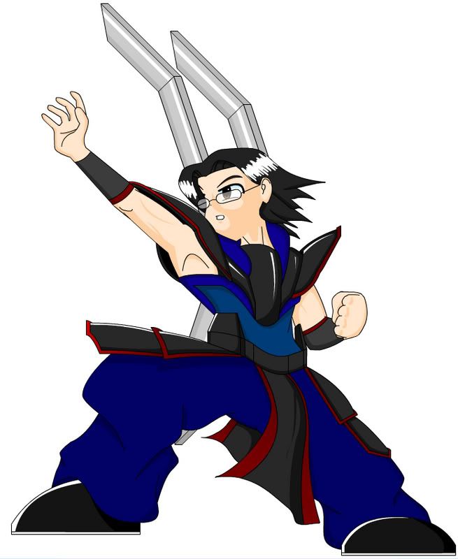
Posted by: ChielScape May 5 2007, 05:01 AM
i was wondering why you drew it in flash. i thought you maybe didnt have photoshop. but if you have, why didnt you draw the entire thing in photoshop?
Posted by: Yoshi May 5 2007, 08:12 AM
Flash is a vector-based drawing tool that I've grown accustomed to through the past couple years, so I'm more experienced with it. Vector art is a lot smoother than drawing it in photoshop (I don't have or use illustrator). When coloring, it's also a lot better and easier than photoshop. However, PS does allow me to correctly blend in colors, but I prefer flash to color, and PS to add spiffy-ness to it like the other picture of the angel.
Also, using a mouse with flash is a lot better than using a mouse in Photoshop. I don't need or want a tablet so I'm sticking with my mouse-drawing that I've been doing for the past 6 years.
Posted by: ChielScape May 5 2007, 01:56 PM
you dont need to draw lines. photoshop can also act as a vector based image editor. (create shapes and use the free_transform_path-tool) and how could coloring be any easier than using the flood-fill option?
what you have made is about the best one can do with flash, while photoshop allows you to make the same kind of pics you find just about everywhere. even the high-quality CG from visual novels is made with photoshop.
it is more complex, yes, but certainly not much more difficult, yet yields greater results.
not that i'm necessarily a PS-fanboy, and if you really like it better, do continue to use flash. im just giving you the facts, not opinions.
Posted by: Yoshi May 6 2007, 05:02 AM
I use flash to also animate. These characters, if I had the time, could be animated as well. The way I color using Flash has the same flood-fill ways of photoshop, however, I define what to flood fill by using lines before applying colors. The quality you see from these images are the same quality that would be displayed in an animation It's like using the mesh tool in Adobe Illustrator, but I have more power over my "mesh" as I can modify the lines before applying the needed color. I try not to go so detailed with my images, as I don't want the quality to differ between animation and drawing. I dunno why, but that's just me.
But back on topic, here's the photoshopped version of the image (very similar to the angel).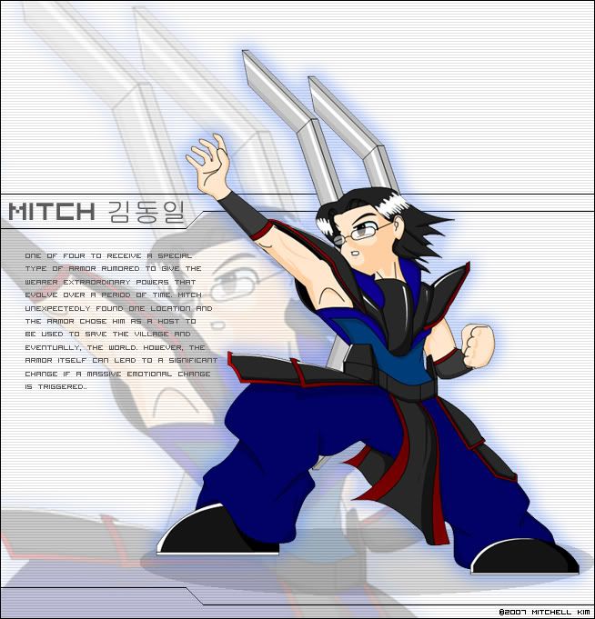
Posted by: -Inuyasha- May 6 2007, 09:49 AM
*lurk*
Posted by: Wes.com May 12 2007, 09:57 AM
here is a not so every day Nod WP.
Posted by: Team Black May 17 2007, 02:57 PM
Well here's my crappy final project for CS2 class - we had to burn a custom CD mix and make a CD cover for it -
I'll post the song list that I used, but I have no time at the moment -
Posted by: tetnis shot ninja May 17 2007, 03:02 PM
thats cool team black. i love how you put all the characters at the bottom.
eh heres just a pic i drew in photoshop.
Posted by: Corsair May 19 2007, 05:30 AM
You come up with the strangest critters TSN, but they're pretty awesome. The drawing and coloring is fantastic! You even took the time to give the critter a nice, big smile
I drew this sometime ago, I think it was for a mod? I'm not sure which exactly, perhaps Omnius'?
Posted by: Team Black May 19 2007, 05:54 AM
@TSN -heh thanks, you know, I put about 2 hours into that CD cover, cutting out the videogame characters and all that...
The project itself was printed onto a 5x5 CD envelope, which was black & white since there weren't color printers nearby -
you couldn't see any of the videogame characters and the whole thing came out lookin like CRAPPOLA!
Dude that creature is freakin freaky! Using partss from all kinds of diffeerent species, yet you still found a way to make it look convincingly like a real creature nice work, man!
Corsair: yea you know what I think about that one
One that I really like though is this one..
Posted by: tetnis shot ninja May 21 2007, 04:07 PM
sorry i havent been here frequently ive got a lot of quizzes and studdying for finals to do.
Yup i notied the smile on him after i started coloring and i thought "does that look wierd?" but thanks for the comments corsair and team black. I do think that i have seen that guy before corsair but he still looks awesome, aspecially the stance. and funny new picture team black, it does seem that way in the movies.
Posted by: Team Black May 21 2007, 04:25 PM
Actually Corsair made that, MSN just totally random
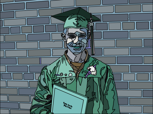
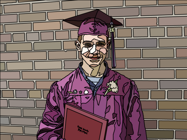
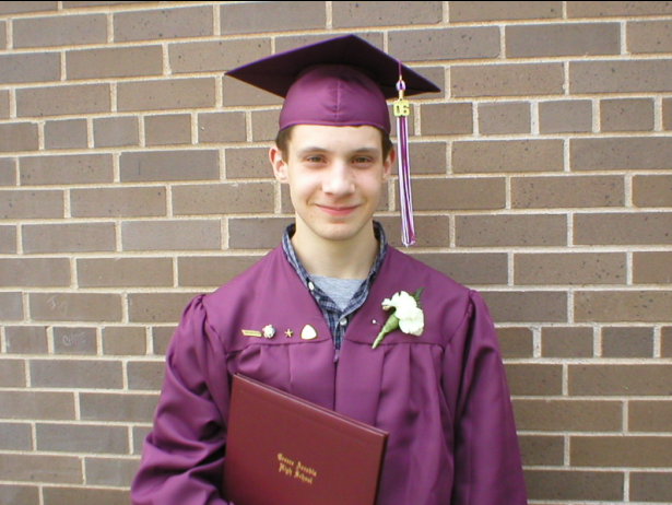
Here's some stuff from my photoshop class. Nothing too special, what we did is got a picture of ourselves and used the pencil to outline it on a new layer, then used the eyedropper & flood fill to fill in each section. Then replaced those colors with complimentary colors and analogous colors..
The picture was taken about a year ago on my graduation from High school - yea our scool colors were maroon and white

Posted by: tetnis shot ninja May 22 2007, 11:33 PM
oh sorry didnt see that............. and still funny.
those are pretty cool. nice use of colors, but i guess that's how their supposed to be. still nice.
Posted by: Wess May 27 2007, 01:18 PM
something i wanted to do for a while. 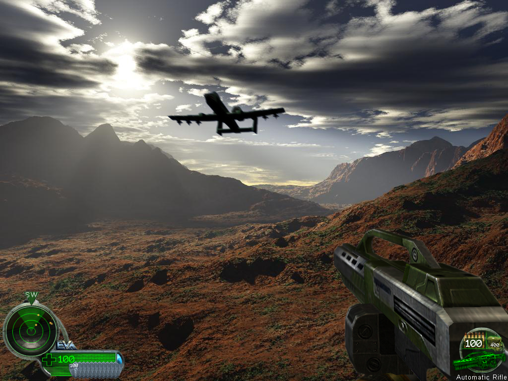
Posted by: tetnis shot ninja May 27 2007, 07:33 PM
hahaha thats funny, not in a bad way. just in that you put the first person aspect into it with the hud. but its cool you added the a-10, just like in TD.
heres a quick photoshop image i did for a class. its supposed to be a concert poster.
Posted by: I_Am May 28 2007, 01:24 AM
I made this for a logo contest.
Sorry for the lage file size.
Posted by: harbringer May 28 2007, 06:03 PM
hey, corsair, how do you do your crosshatching? its really finely done. do you use a pencil or photoshop? and can you teach me how? please?
Posted by: Corsair May 29 2007, 03:28 PM
I just use the good ol' fashioned pencil, and I'm afraid its something I can't really teach you through the internet
Posted by: Tore May 29 2007, 06:31 PM

Hey thats my TS base! XD
Posted by: harbringer Jun 8 2007, 03:12 PM
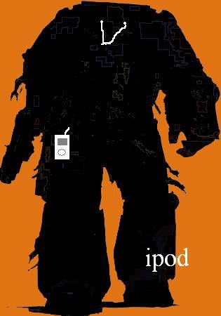
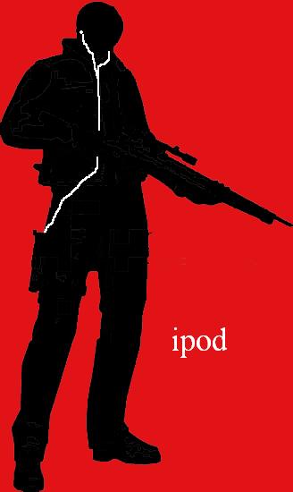
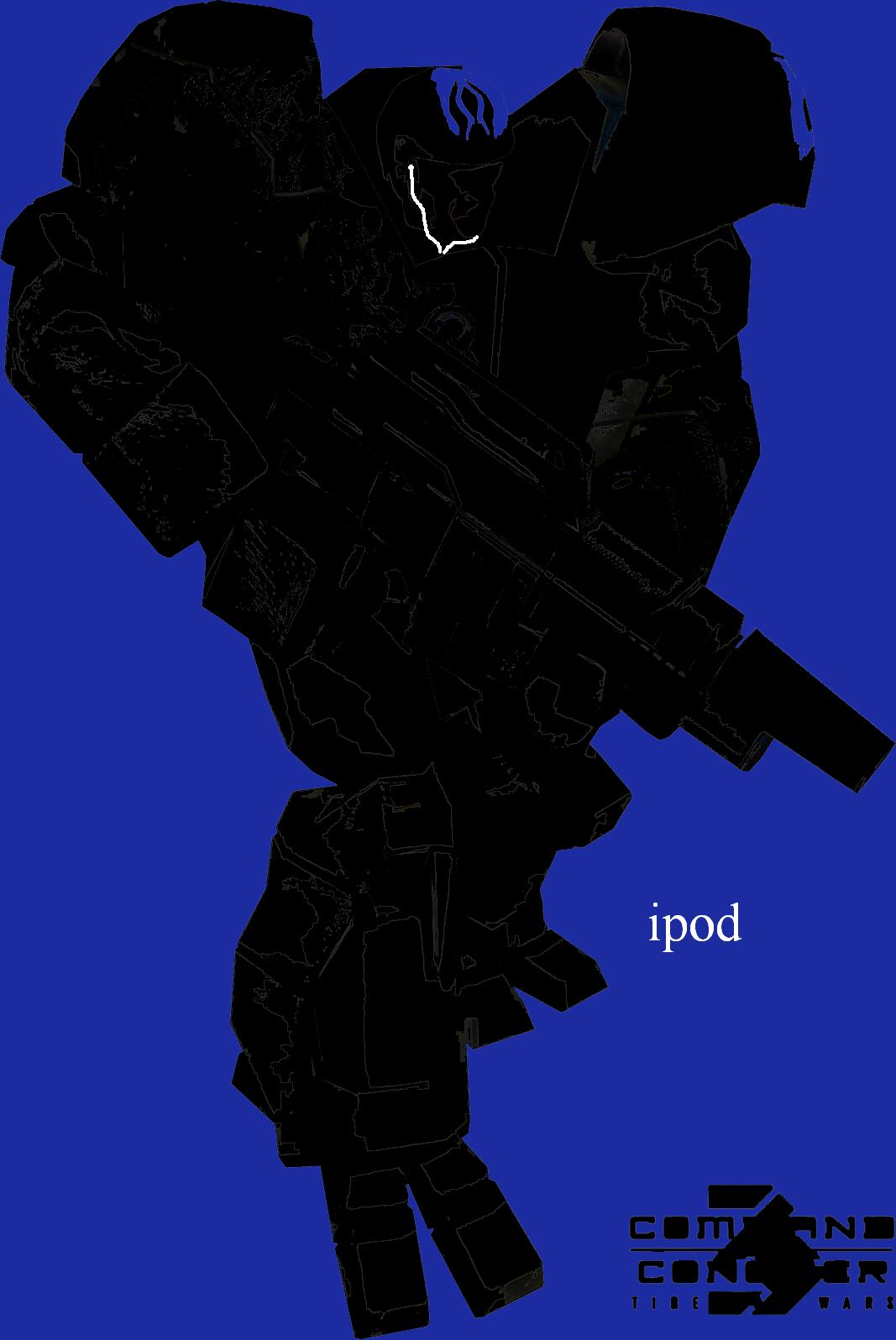
hang on, i can put up some ipod ads that i made... lookee!! one is of a zone trooper, another of leon kennedy (resident evil 4), an antlion (half life 2), dark samus (metroid prime 3) and a space marine (warhammer 40k) 
sorry if they're very big, my resizer is a retard...
Posted by: Mighty BOB! Jun 9 2007, 06:48 AM
Psychology. Pic done in Photoshop, printed on glossy photo paper, mounted on black board, emergency broadcast system test pattern done with a white colored pencil.
http://i4.photobucket.com/albums/y110/mightybob2000/School/Final2.jpg
Posted by: Corsair Jun 17 2007, 08:20 PM
While on my vacation I started a couple of drawings... but I failed miserably in finishing them
So heres some of what I got
Posted by: tetnis shot ninja Jun 25 2007, 11:40 PM
sorry i haven't been here for a while, ive got relatives visiting and theres not much time for the comp.
looks kick ass though corsair, i really like the cyborg. nice chain gun arm.
heres a pic i made in photoshop from a few different pics.
Posted by: Corsair Jun 26 2007, 12:13 AM
All I can say is just Wow
Speechless 
That just looks flawless
Posted by: Mechanical Jun 26 2007, 12:20 AM
Pretty damn good. Flawless, maybe not, but beyond my capabilities, so I can't really pick at that. Solid sci-fi, man.
Posted by: tetnis shot ninja Jun 26 2007, 07:03 PM
thanks for the comments guys.
and mechanical, ive seen your gallery and it looks like you could do stuff like this if you tried.
Posted by: Nintyuk Jun 27 2007, 05:41 PM
this is the first drawing i have actually managed to up load to my PC
i don't know the best way to coulor it though, any tips?
Posted by: Yoshi Jun 27 2007, 07:45 PM
I am back with new drawings, even though I have to make this short as I have to go back to class soon, here they are and yeah yeah, anime, blah blah blah:


I don't think I can post flash files, but oh well.
Quick SWF:
http://ragnarokbattle.net/flash/keke.swf
And finally, a compiled flash music player. Actionscript is simple, but semi complex. Animation is VERY fluid.:
http://ragnarokbattle.net/flash/player.html
Posted by: Corsair Jun 27 2007, 08:42 PM
i don't know the best way to coulor it though, any tips?
I'm sure Tetnis would be able to help you out quite a bit
I, however, cannot - I'm not a coloring kind of guy
Posted by: Dog Of War Jul 5 2007, 01:02 PM
Latest signature i made myself on Photoshop...

EDIT: Don't ask who she is if your wondering, i have no idea.
Posted by: Corsair Jul 6 2007, 04:07 AM
You made it for yourself but your not using it!
Posted by: ChielScape Jul 6 2007, 08:48 AM
EDIT: Don't ask who she is if your wondering, i have no idea.
looks like Nobue from Ichigo Mashimaro
Posted by: brotherhood23 Jul 10 2007, 08:07 PM
ehhh this just something that i whiped up
its some guy in my google sketchup model with an anti matter gun (trying to animate this)
Before and After... erm... ok ... have fun ... i guess 
P.S.: wait 5-10 secs for the pics to load/ BIG PICS!

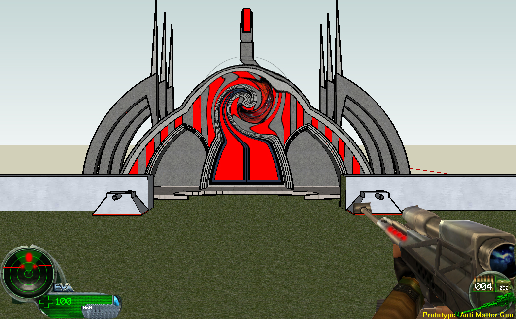
Posted by: Master Blackster Jul 11 2007, 08:28 PM
looks interesting.. who made the Temple there?
Posted by: brotherhood23 Jul 11 2007, 08:44 PM
its some guy in my google sketchup model with an anti matter gun (trying to animate this)
Before and After... erm... ok ... have fun ... i guess
P.S.: wait 5-10 secs for the pics to load/ BIG PICS!
the turrets are mine and the temple is dutch forces...
my buildings are on the other side of the model
and they are the airstrip,pp,tib ref,
Posted by: Corsair Jul 31 2007, 05:56 AM
I had the entire scene up, but it got really slow when the planes reached the top left
So to prevent anyones eyes from getting ruined by its crappiness, I cropped it down
I put up a picture of how it would have looked though - and http://img339.imageshack.us/img339/4740/area0004se5.gif is a link to the whole thing if you really want it
(And its in a loop, so don't bother me by saying its repetitive )
Its really one of my first animations, so please be nice!
Posted by: TSHyper Jul 31 2007, 03:16 PM
Can i join it?...
I remade some C&C logos the other day...
http://www.ppmsite.com/forum/viewtopic.php?t=15597
Posted by: Corsair Aug 3 2007, 09:55 PM
I like TS:RO's better
Posted by: Team Black Aug 4 2007, 05:07 AM
^^I'm with that guy =P
(still very nice though XD )
Posted by: Crash-King Aug 4 2007, 03:43 PM
Luke's logo is best, final I especially like the C&C3 logo. But I think the background was kind of.. not what I'd like.
Posted by: Dog Of War Aug 14 2007, 11:50 AM
I am using it, just not here since my name is different (~_~) wait a minute.... i am using it, wtf!
Sorry for my VERY late reply, I'm lazy ._.
EDIT: I chose to hide my sig when i posted it actually, thats why it wasn't there... -_- oops
I made http://i28.photobucket.com/albums/c226/Blaze_The_Chronic/Signatures/KillyTag1.png a while ago but i think it's a bit turd
. It be Killy, from the BLAME! Manga.
Posted by: Team Black Aug 17 2007, 05:33 PM
I just scanned some more of my stuff - more recent than the other stuff ~~ 2003 to 2005 ish
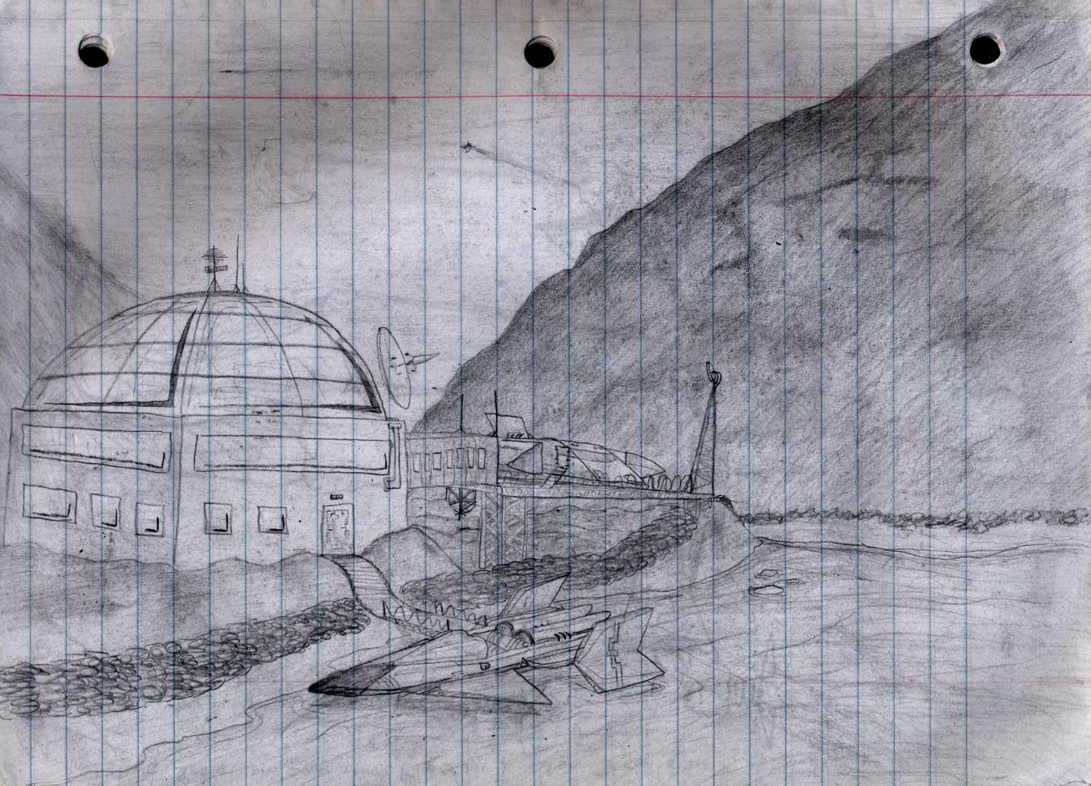
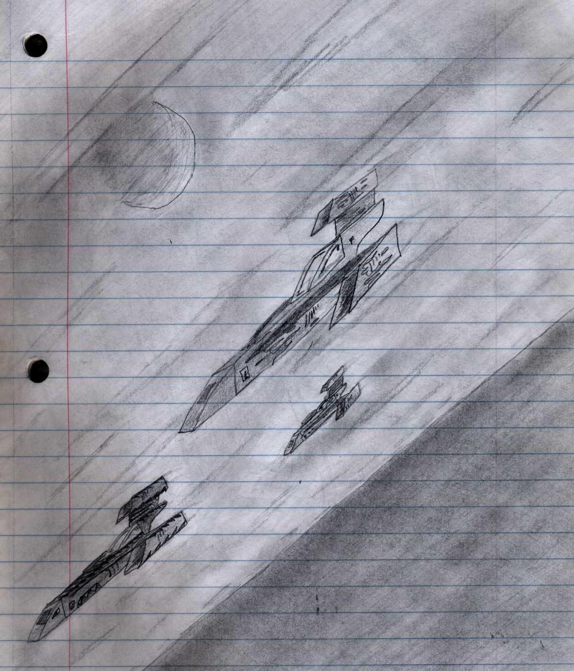
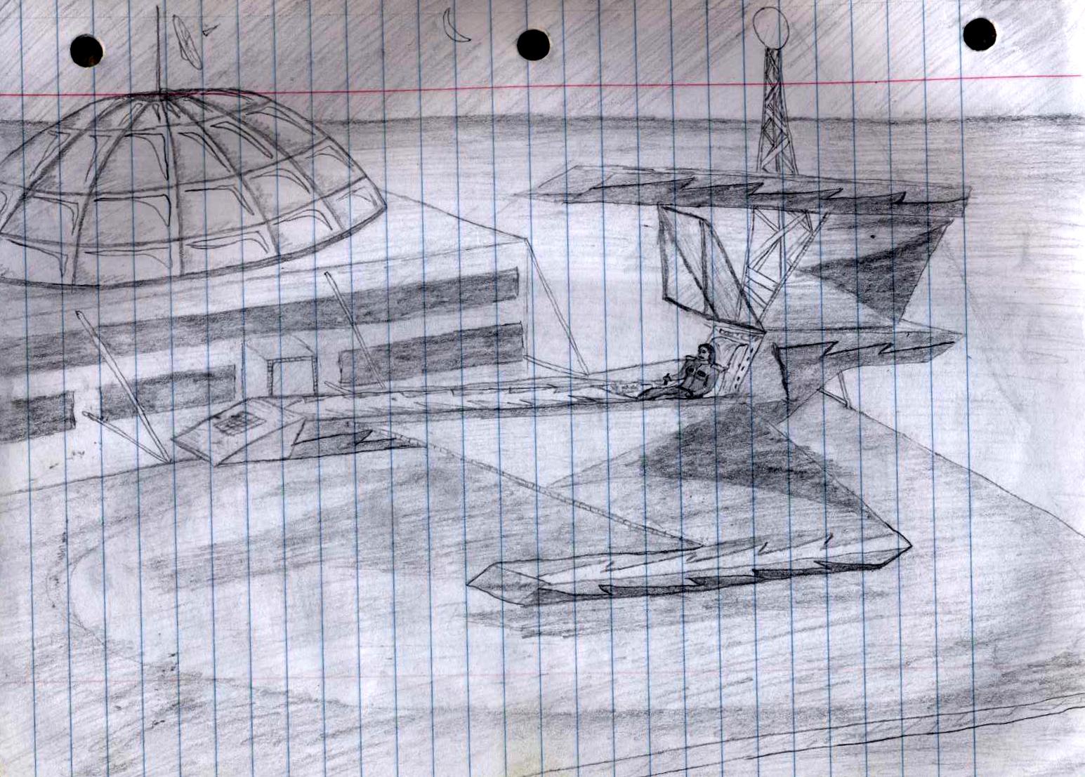
To view the pics better, right click on them and select "View Image"
Some Star destroyers I drew in 2003: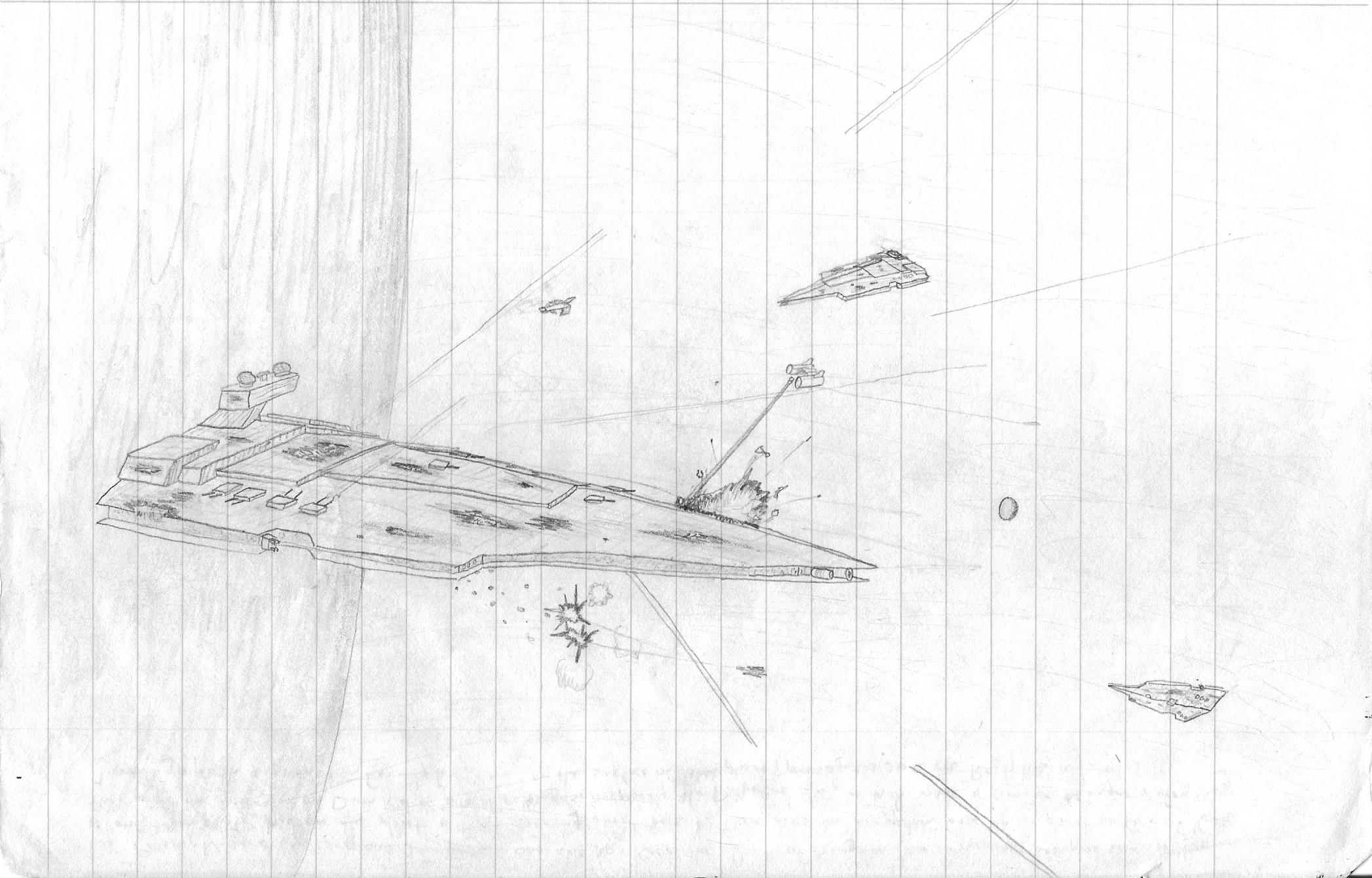
A summer retreat in 2003, on the balcony looking out (please ignore those hideous trees ) :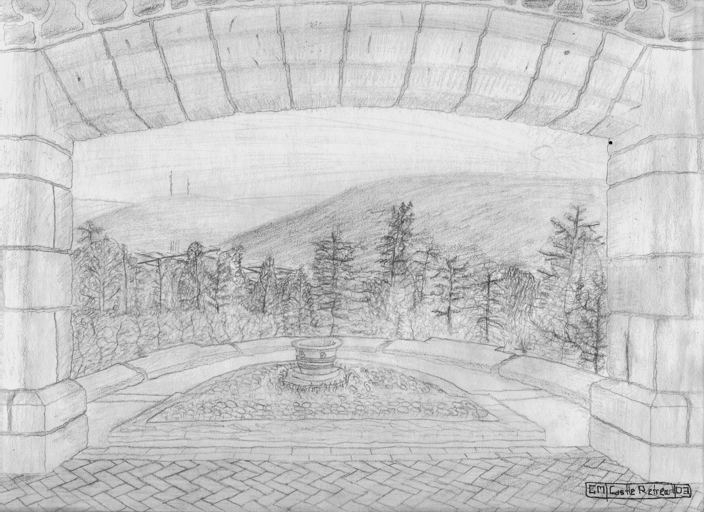
The same place, 2 years later (2005) - looking back on the balcony (This one's incomplete- I spent so much time on those freaking cobblestones ) :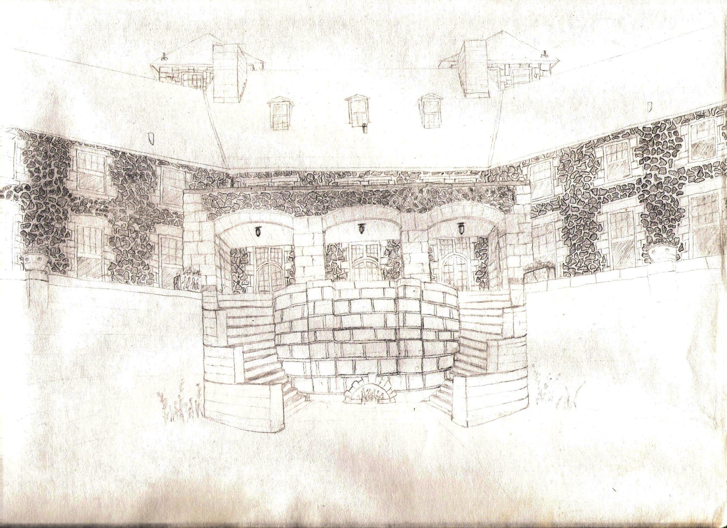
A flying island I made in 2003 - someone make a guess what inspired it :o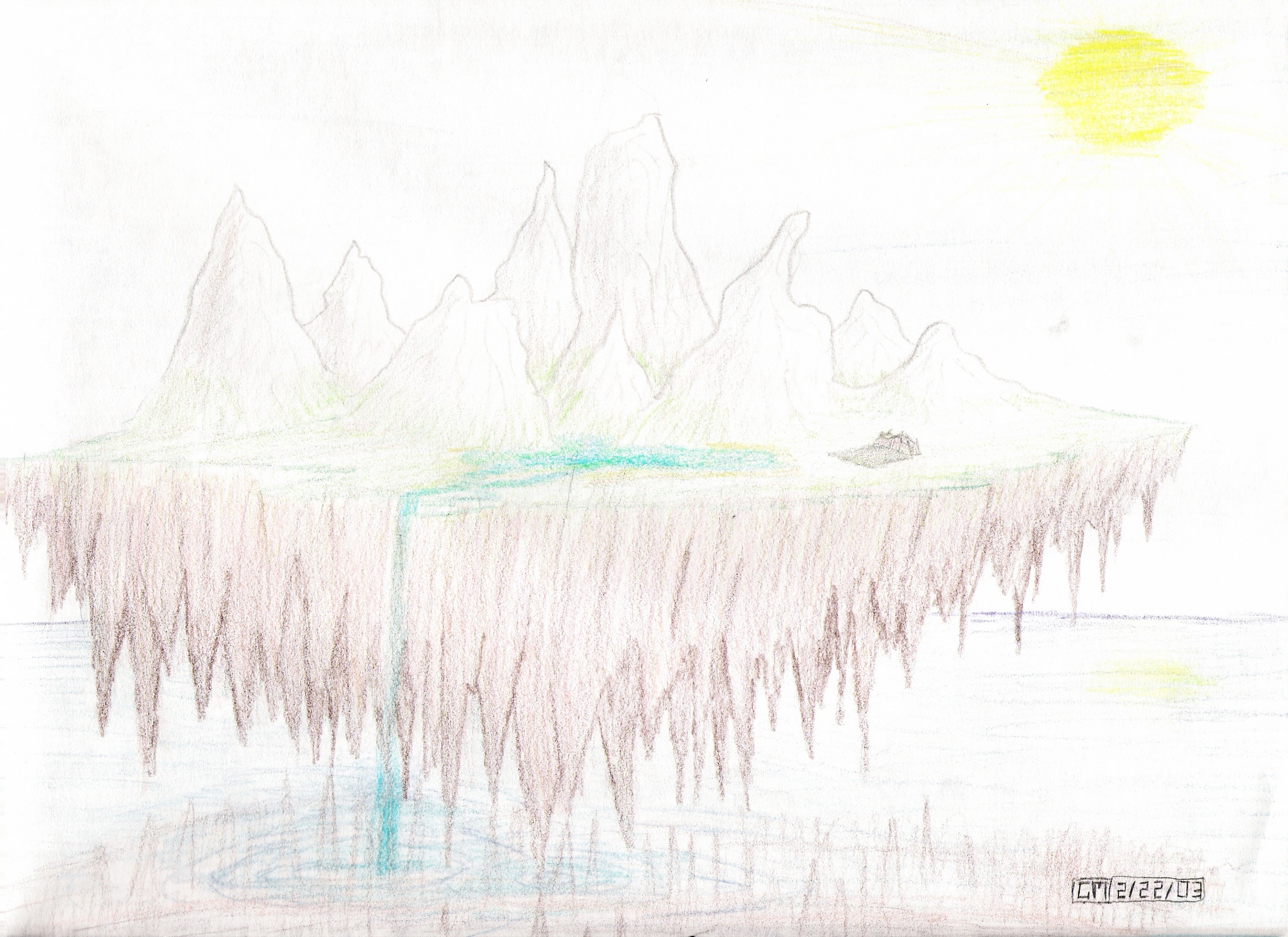
This is a pic I drew of my room back in 2003 (I've moved since then) :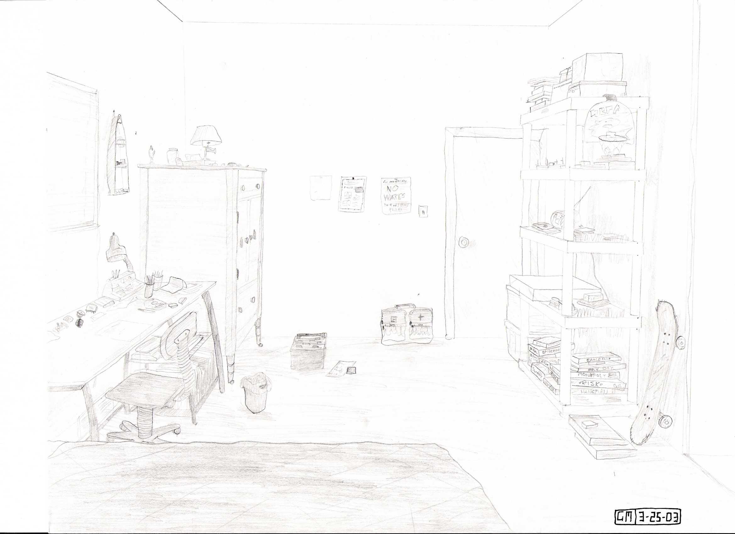
A gigantic castle, was inspired by Minas Tirith back when Return of the king came out..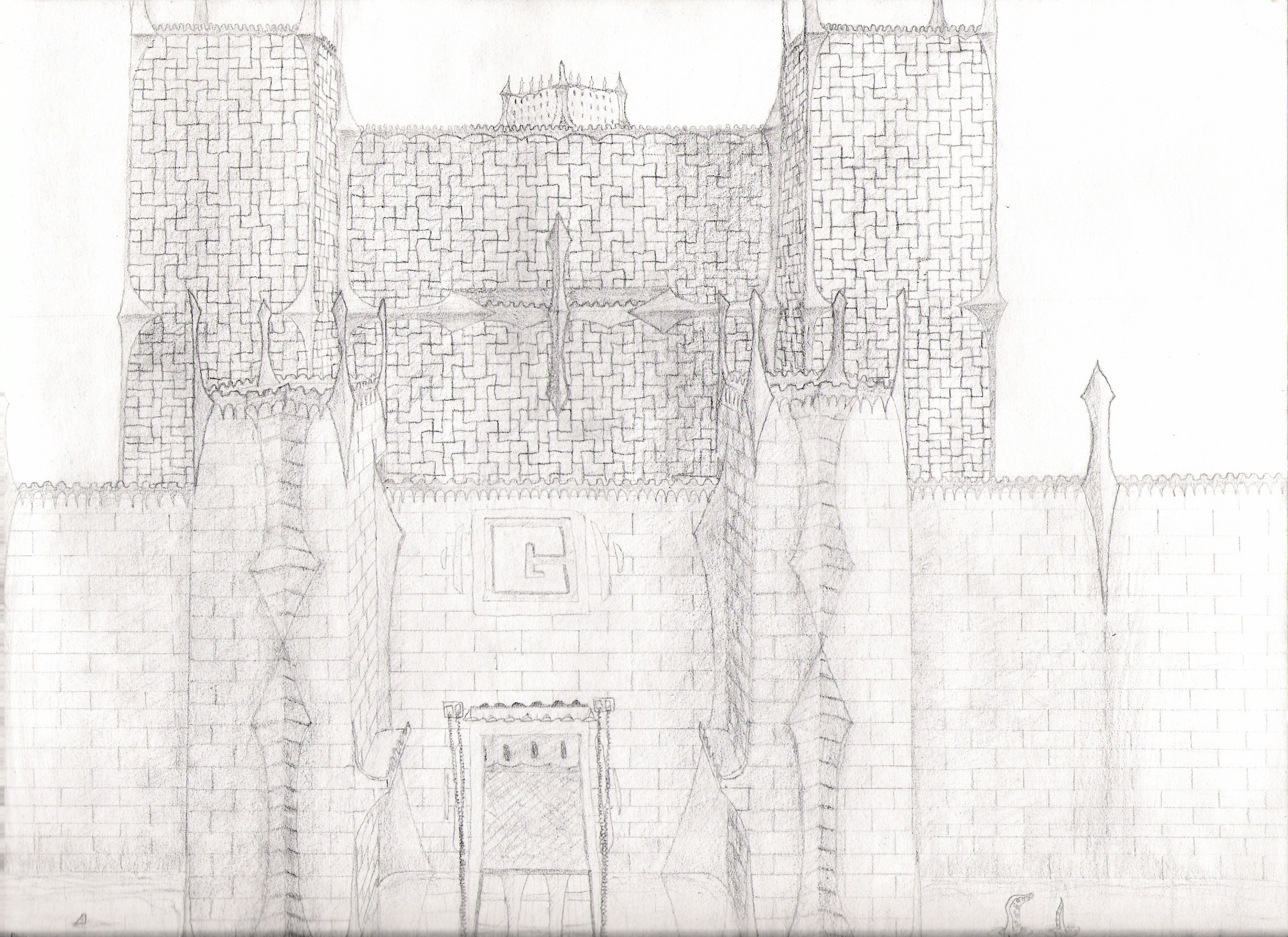
I'll see if I can get some more pics scanned, and maybe start drawing again.. the last time I really drew a real picture was that fortress there, and that was back in 2005
Posted by: Corsair Aug 17 2007, 09:20 PM
Those are some awfully large pictures of your drawings
Posted by: Tore Aug 17 2007, 09:34 PM
(Ok I think this is the right topic to post this. XD)
Ok I made a Red Alert signature. But I am not sure if I want to use it... (If you want to to use one of them, Ask me.)
Signature with my name on it:
Empty signature:
First version:
What do you think about them?
Posted by: Lin Kuei Ominae Aug 20 2007, 07:56 PM
Flash Gorden: i think there was a cloud city
Stargate: the flying city of the Nox
Gorillaz: Music Video of El Manana
@ Tore
i dont like the Aircraft. It looks lame and from the side just like a flying torpedo. A different perspective would be better.
Or maybe you use this:

The ecranoplan was back in the cold war a masterstroke of the art of russian engeneering. First of all the americans couldn't believe what they saw.
Posted by: Tore Aug 20 2007, 08:07 PM
i dont like the Aircraft. It looks lame and from the side just like a flying torpedo.
No one remembers the Badger Bomber from Red Alert 1.
 Hmm....I will get a screen of the RA1 Mig.
Posted by: Biohazard Aug 29 2007, 06:38 PM
Not really to do with TS but heres some thing i did for my art exams and just when im bored...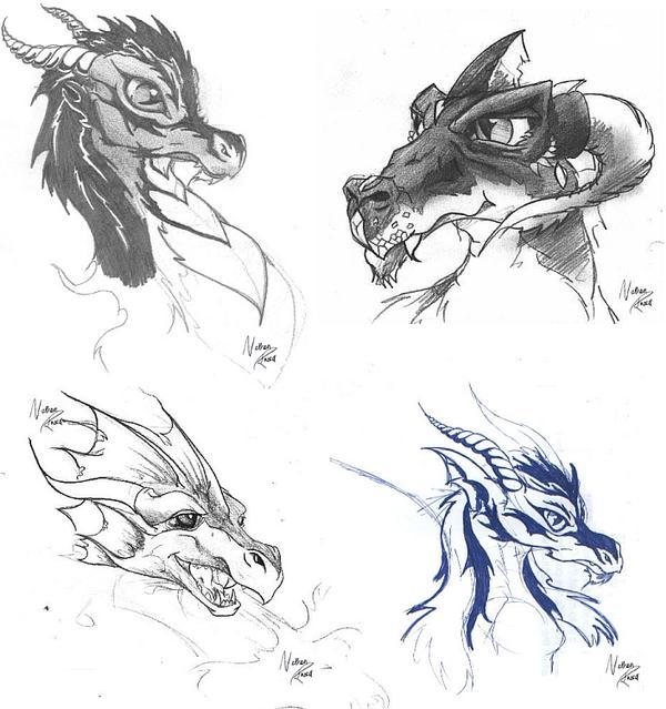
I've got some more somewhere...i'll scan them in when i find them.
Thanks, Biohazard
Posted by: Corsair Aug 30 2007, 07:14 PM
I really like the curve of the dragons, they flow really nicely
Posted by: Biohazard Aug 30 2007, 07:24 PM
Thanks
I just did them in my spare time, nothing special.
Posted by: Thundgot Aug 30 2007, 10:20 PM
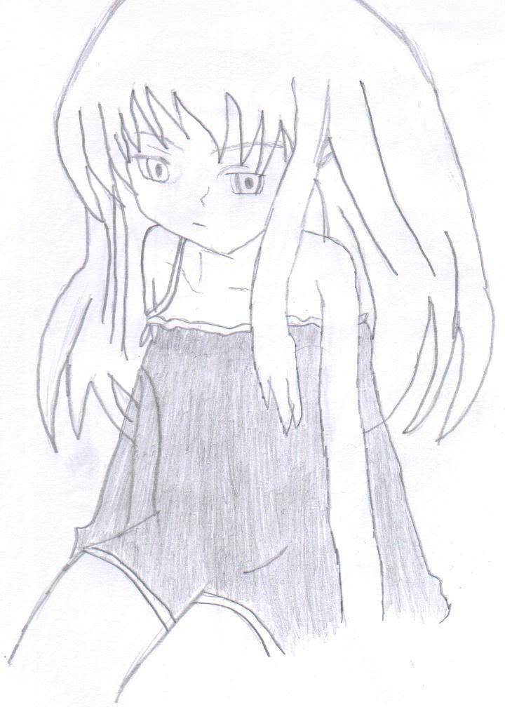
And this is the reason I have not been here for a while...Been practicing my drawing =3
Posted by: Yoshi Aug 30 2007, 10:46 PM
A word for anime-haters, don't just say "I hate anime" or anything like that and end it, we already know you do from various posts *cough* Corsair and Wondle *cough*. Try to look past the fact that it looks anime-ish.
If you want me to rank your drawings, the third one is too... scary. I don't really like it, but that's my own opinion. The proportions on it are a little more fitting but the feet and hands are still rather small, and the face needs to be worked on completely. Her hips are way too tall for her size.
The second one is okay, the face needs to be worked with as well. It's way too big for her body unless you're trying to go for the "chibi" aspect of it.
The first one is alright. Again, there's the issue of the head. It's way too big. The hair is also kinda... out there, maybe giving it a more natural look by keeping it down without adding a "poof" effect unless she's in the process of sitting down. Her nose is very much-so incorrectly placed. From the perspective of her face, the nose should be closer to her right eye. There's something awkward about her pose, it might be the position. If I were to pose it out (yes, I actually pose myself before I draw something to see if it's comfortable, uncomfortable or impossible), it would probably feel a little stiff. Honestly, I have no idea where the camera is supposed to be placed at. Her arm needs to be widened as well, it seems like someone could break her arm with a small flick.
Other than that, you've been improving. I also highly suggest that you keep your eyes consistent in style, unless you're drawing from another character in a different anime, then that's acceptable. However, if you're doing your own style, keep it consistent.
Posted by: Thundgot Aug 30 2007, 10:58 PM
What you said about the first drawing is almost the exact same thing I got from someone at DeviantART Thanks for giving a good critique about the drawings, and I am drawing after another image on the internet, not a drawing but a computer made one, so sometimes I can miss badly XD (in other words, its not my own style =3)
On the second drawing its for the most a chibi style, at least I think the image I was drawing after was like that, Im not really sure
The third one is an old drawing I had, I just modified it a little by re-doing her hair, and fixing the one eye which looked kinda...f*cked up tbh
Posted by: Yoshi Aug 30 2007, 11:54 PM
Yessums, but here, I will show some more of my artwork, I dunno if anyone really saw them or not (forgot if I posted them in here) :
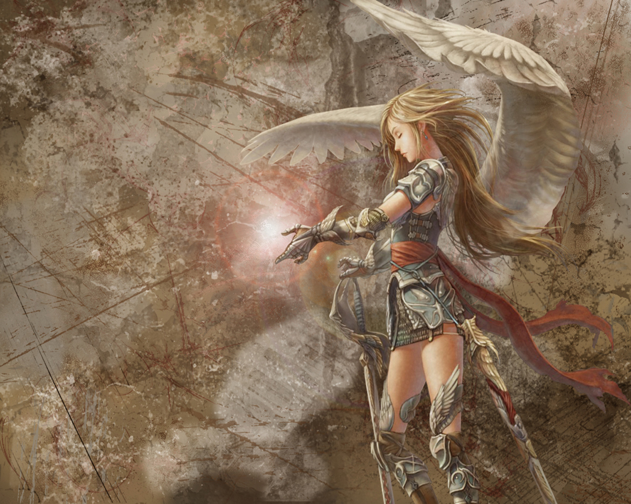
Angel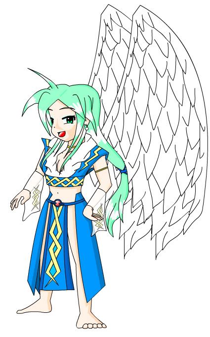
My comic character in one of my "spin offs" from my original series. This is when I had longer hair and NO, this was not inspired by DBZ.
Part of a summer drawing/coloring that I haven't even finished
Part of the summer drawing as well (the feet are covered in the drawing btw)
Web design splash page:
Posted by: daTSchikinhed Sep 10 2007, 11:15 PM
Yeah.. I got bored and made me a new sig... (along with a new http://www.myspace.com/datschikinhed ) lol
Comments (on both?)

Posted by: TSHyper Sep 13 2007, 10:05 PM
Err Yoshi... PLEASE do not tell me thats vector based work... i think im going to kill myself 
Posted by: Yoshi Sep 13 2007, 11:20 PM
Yeah, it's vector-based artwork.
Developed in flash though. I don't use Adobe Illustrator.
Most, if not all, my animations are all vector-based.
The way I draw wings though are different now.
Posted by: Warlord Sep 14 2007, 07:35 PM
I decided to post some quick banners i made. 

Which one do you think looks best? 
Posted by: Corsair Sep 14 2007, 07:36 PM
Better of the four
Posted by: daTSchikinhed Sep 14 2007, 10:41 PM
3 hours of work in Ad Design Class... and I came out with this so far... I Checked, and AMP'D is okay for the name of a Graphical site. I'm starting an Online Portfolio for Ad Design class. With only that small amount of work, I have come pretty far IMO. Once I get my workstation back up on MY computer, It'll be up pretty quick, and I'll be able to fix the graphical error at the top where the streaks fade to black.
opinions?

Posted by: wondle_donkey Sep 14 2007, 11:56 PM
Too black and white, I know theres probably a certain style there but personally I don't like it. With colours it could look Very nice, however. Capitals used to emphasize how nice it could look. Yeah.
Posted by: Vintriaz Sep 16 2007, 11:10 PM
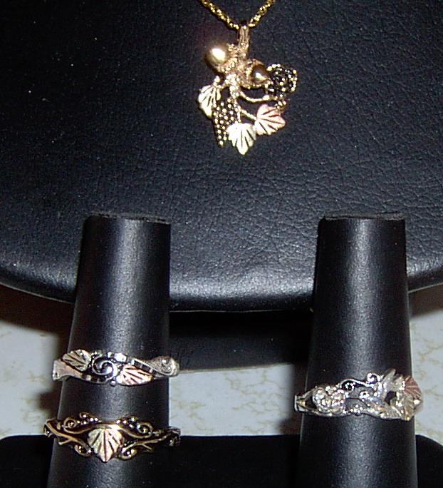
Well I thought it was time to post here, so this is some of my artwork. Ironicly this is also what I do for a living. I craft black hills gold jewelry. So if you ever find yourself in the black hills of South dakota, swing by Whitaker jewelers in Hill City & say "Hello" This is only a miniscule amount of what my parents & I craft. The peices shown are ones that I came up with. Sorry that it's a bad picture, But jewelry is difficult to take a good picture of.
Posted by: Warlord Sep 23 2007, 10:30 AM
I made this recently and was just wondering what you guys thought of it:
first GIF sig i've ever made btw ^
You can use it if you want.
You don't have to ask me or credit me in any way.
@Vintriaz: my grandad used to have the same job as you when he was a lot younger
Posted by: Vintriaz Sep 23 2007, 03:17 PM
Cool. It's fasinating what you can learn by talking isn't it? Small world I say.
Posted by: CrashKing Sep 25 2007, 05:54 AM
That's so true.. I met my neighbour in Denmark...
The sig... looks ok.. easy though.
Posted by: Nod Strike Sep 25 2007, 04:01 PM
Sig looks good. Try slowing down the WS Logo though.
Posted by: Vintriaz Sep 26 2007, 01:41 AM
I like this one the best so far warlord.
Posted by: Warlord Sep 26 2007, 07:11 PM
Thanks for the comments.
EDIT: is this any better NS?
Posted by: daTSchikinhed Sep 27 2007, 05:47 AM
yeah, slower is good when it comes to logos..
Btw, new siggy.
I'm totally diggin it. <3
Posted by: Nod Strike Sep 27 2007, 02:50 PM
Both great sigs.
Posted by: Warlord Sep 28 2007, 07:06 PM
Wow dats. That's a really good sig you have there
good job.
Posted by: daTSchikinhed Sep 29 2007, 03:03 PM
w00t! moar art!
but this time it's NOT DIGITAL!
and they're all .gif... so they load SUPAH FAST!
Angel. Personal Project.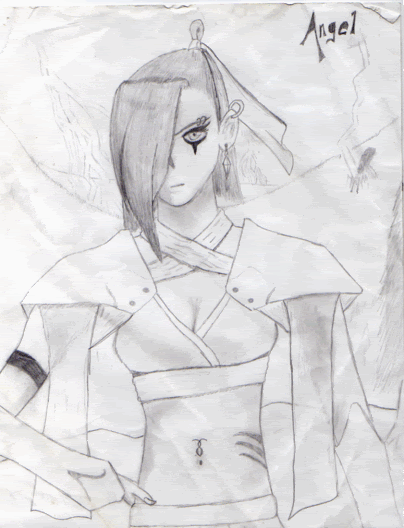
EvelAngel Inc. Line Art Project for Drawing Studio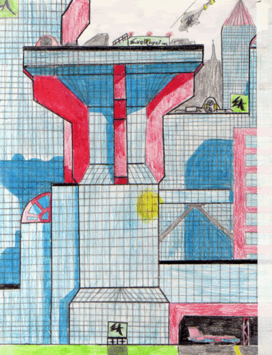
Just boredom, really.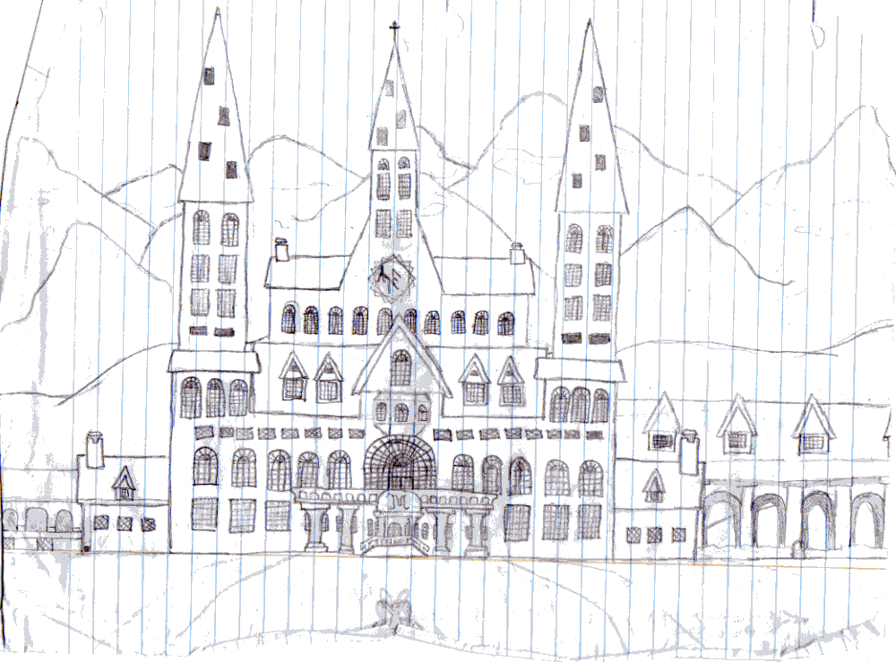
Posted by: Nintyuk Sep 29 2007, 04:34 PM
i just got a wacom pen tablet and this is me trying it out
but i cant find a desent skin coluor tho


Posted by: daTSchikinhed Sep 30 2007, 07:44 AM
Another for PPM, since the controversy was pushed way out of hand by gosho. 
Posted by: TSHyper Sep 30 2007, 08:44 AM
Maybe more towards C&C orientated ones, it seems they are starting wars them selfs
Posted by: Yoshi Sep 30 2007, 09:57 AM
Here comes a quickie.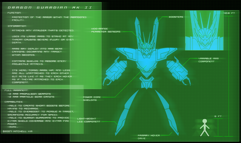
Sketch for an animation I will be doing and this thing will be in it. Going to be a bitch to animate, but in the end, it will pay off, hopefully.
Posted by: daTSchikinhed Oct 1 2007, 05:38 AM
holy SHlT! Three in two days!
Posted by: Yoshi Oct 1 2007, 06:34 AM
Edited version with back and side views. I screwed up on his side shoulder armor, but oh well: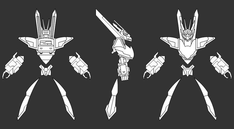
Posted by: TSHyper Oct 1 2007, 03:52 PM
VERY nice Yoshi!
Just finished my collection of Westwood logo variations...
http://www.ts-recoil.ppmsite.com/images/WestwoodStudiosInc_Collection.png
Posted by: Yoshi Oct 2 2007, 04:34 AM
Thanks TSHyper. Your logos are very well done as well. Were they made by vector or 3D Modeling?
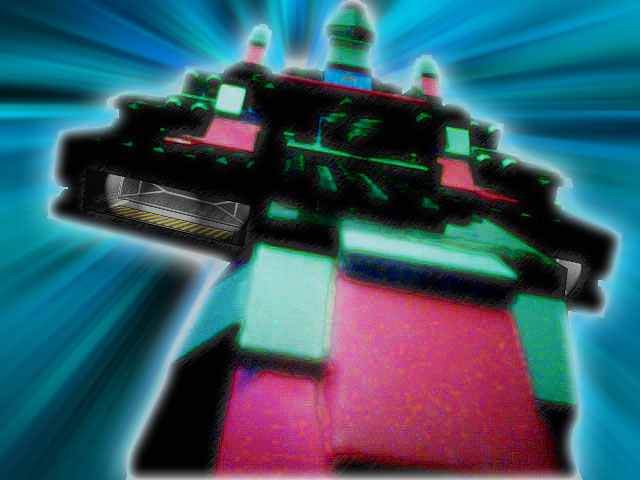
Here's a character sketch, while I was bored in class, of armor "levels":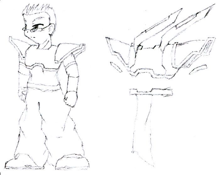
Posted by: TSHyper Oct 2 2007, 11:35 AM
There Vector, i use Adobe Illustrator for it. It has a basic 3D effect tool was is nice ^_^
Posted by: Yoshi Oct 17 2007, 10:22 AM
I just noticed that drawing is based off of the Ragnarok Online Official Artwork for the assassin class. XD
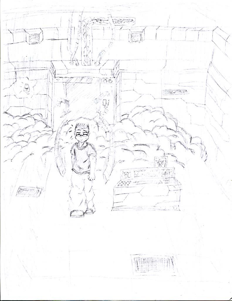
But not only pointing that out, here's another drawing. The scene before one of the main characters gets his armor. This isn't a final sketch as this is just one part of it. Still making a "storyboard" for the animation, but first, the script, then storyboard, then animation process in Flash. Yes, this is a one-man team.
:
Powered by Invision Power Board (http://www.invisionboard.com)
© Invision Power Services (http://www.invisionpower.com)